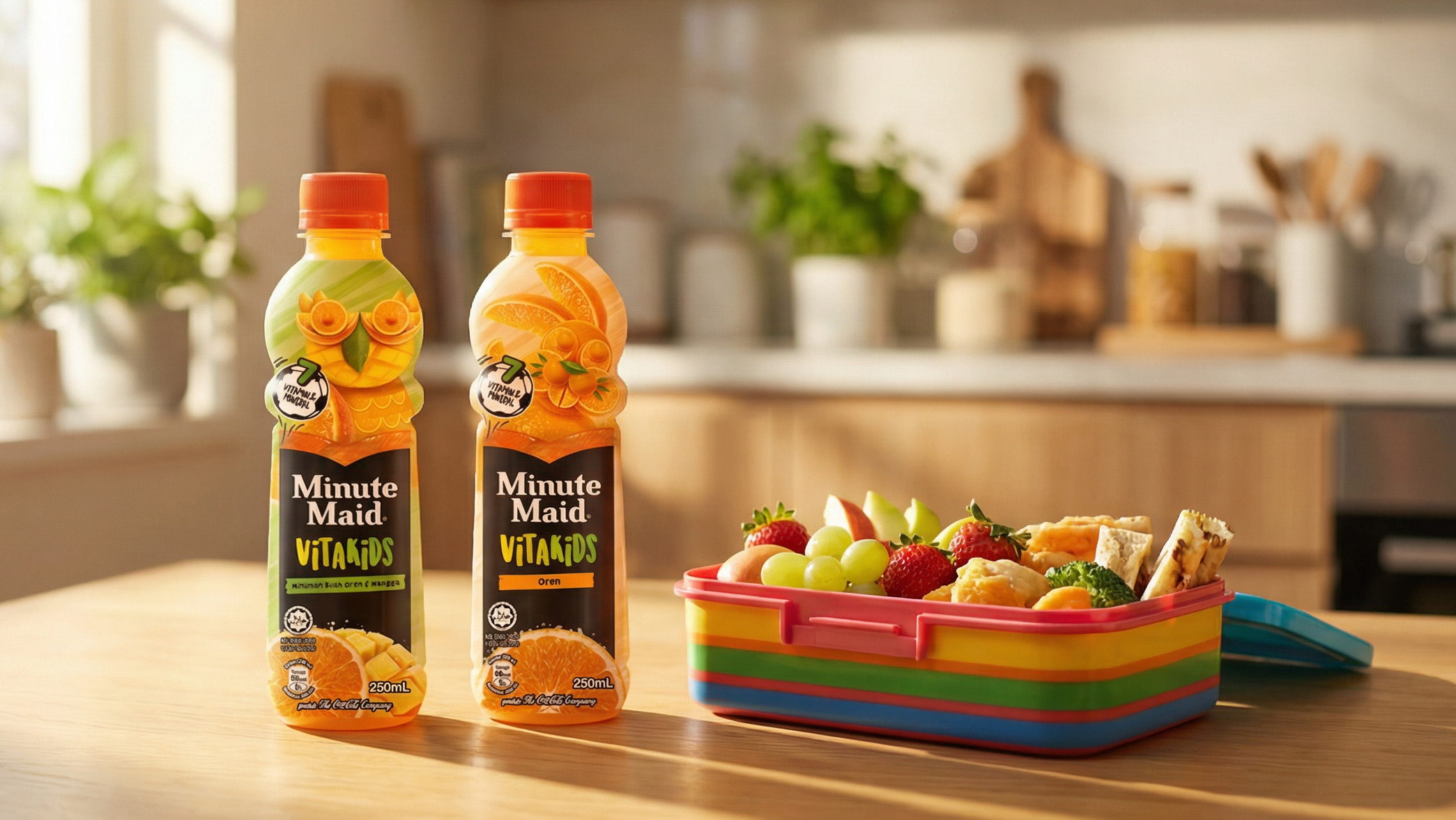
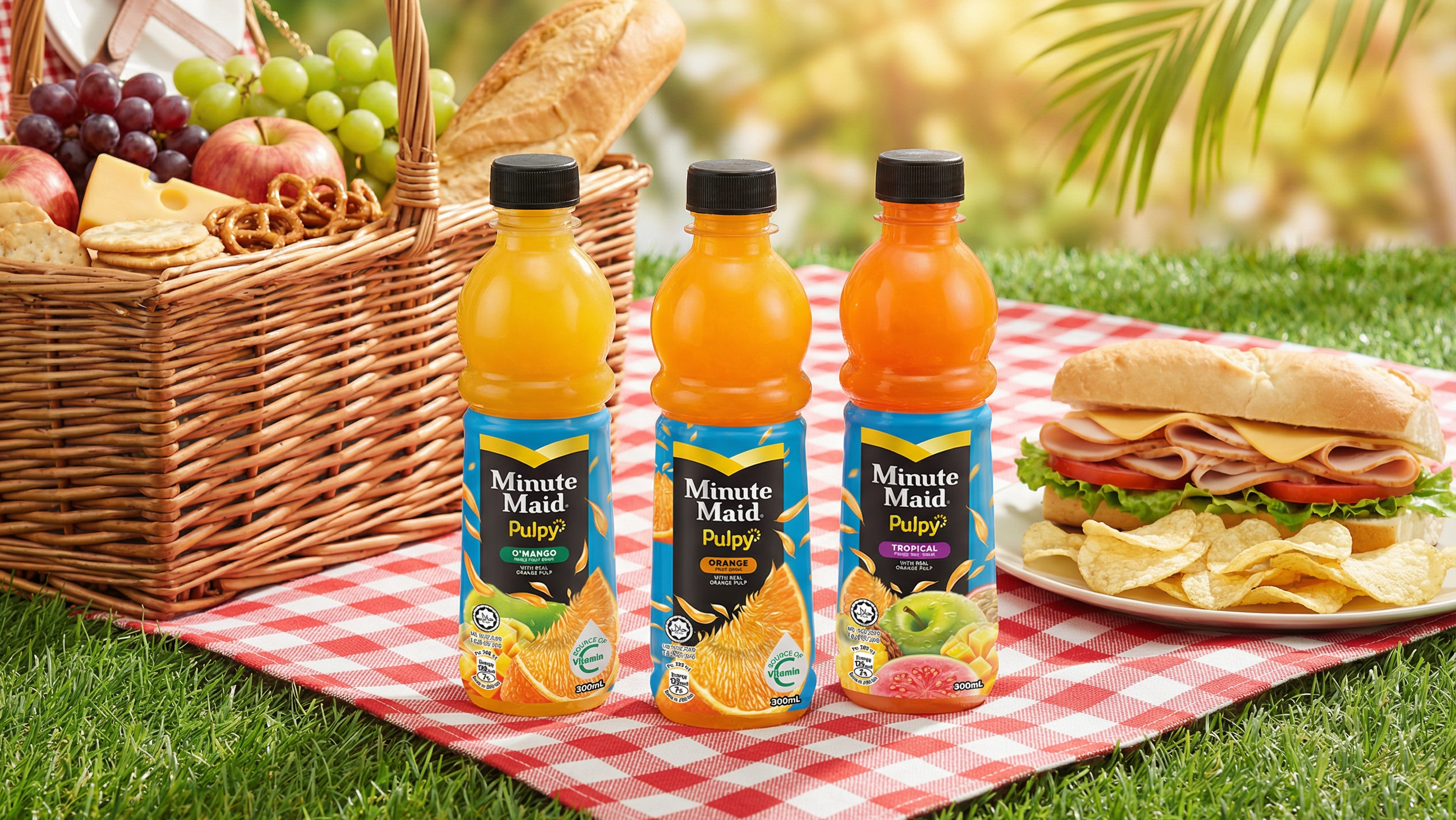
Client: Minute Maid Refresh (The Coca-Cola Company) | Category: FMCG, Beverage, Juice & Juice Drinks, Slim Can Format | Discipline: Packaging Design, Multi-Variant Slim Can Range, Beverage Pack Architecture | Scope: Slim Can Pack Design Across Four Variants, Variant-Specific Photographic Fruit Composition, Range-Wide Black-Anchored Visual Register, Condensation & Cold-Pack Illusion Rendering, Bahasa-English Bilingual Architecture, Brand Authority Lockup | Variants: Apple Fruit Drink, White Grape Mixed Fruit Drink, Red Grape Fruit Drink, Orange Fruit Drink | Format: Slim Aluminium Can | Market: Malaysia | Agency: Laugh Contagious Communications, Kuala Lumpur
For Minute Maid Refresh's slim can range, we built the pack design so that the composition splits cleanly into three zones: a refreshing sky-blue top with splashing fruit imagery, a deep black central brand panel carrying Minute Maid Refresh in stylised cyan-accent typography, and a saturated fruit-cluster base in the variant's signature colour. Each of the four variants — Apple Fruit Drink, White Grape Mixed Fruit Drink, Red Grape Fruit Drink, Orange Fruit Drink — runs the same compositional architecture with different fruit photography and a variant-coloured pill badge, so the range reads as one system at shelf glance while differentiating instantly by fruit and colour.
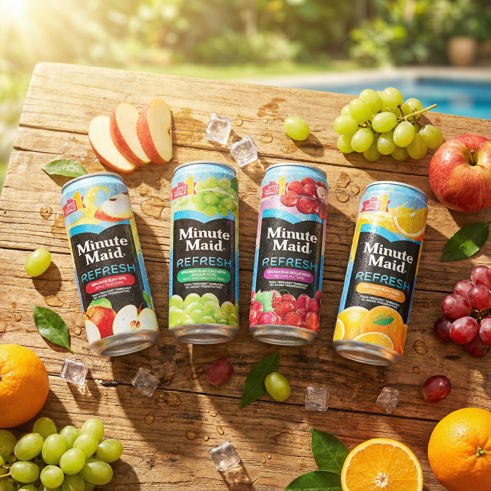
The full four-variant range — Apple, White Grape, Red Grape, Orange — with fresh-cut fruit and ice, framing Minute Maid Refresh as serious adult refreshment.
Two design decisions hold the system together. First, anchoring in black, not bright — a counterintuitive choice in a category that defaults to white-and-pastel-sunshine, but one that gives Minute Maid a premium visual register closer to grown-up refreshment than to children's juice pouches. Second, hero'ing the No. 1 Juice & Juice Drinks Company in the World authority badge alongside the Tiada Pengawet Tambahan / No Added Preservatives trust claim — Coca-Cola's category leadership paired with the ingredient honesty Malaysian beverage shoppers actively look for. Bahasa-English bilingual variant naming closes the trust loop. As a creative agency in Kuala Lumpur, we designed the system to fire the thirst reflex first and earn the trust second — in that order, because that's the order the shopper buys.
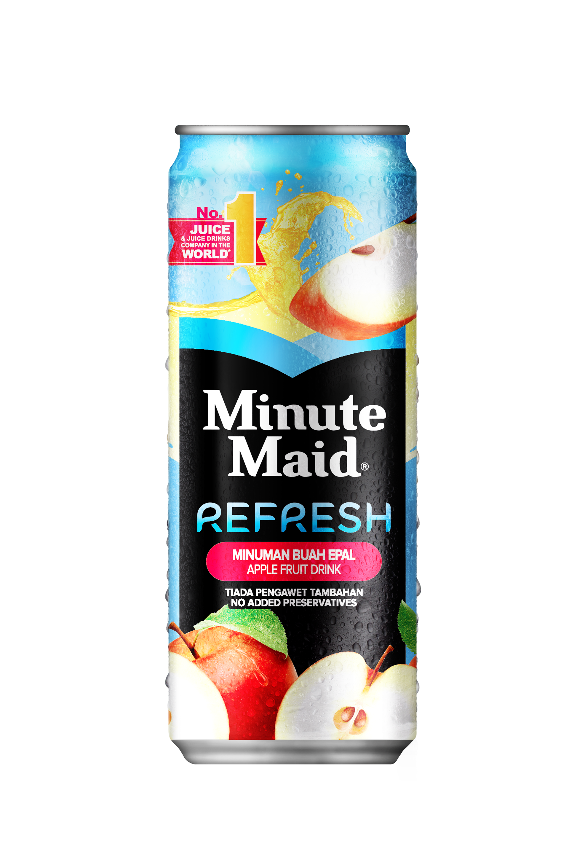
Apple Fruit Drink (Minuman Buah Epal) — the brand panel in deep black with the splash of golden apple juice and red-apple imagery anchoring top and bottom.
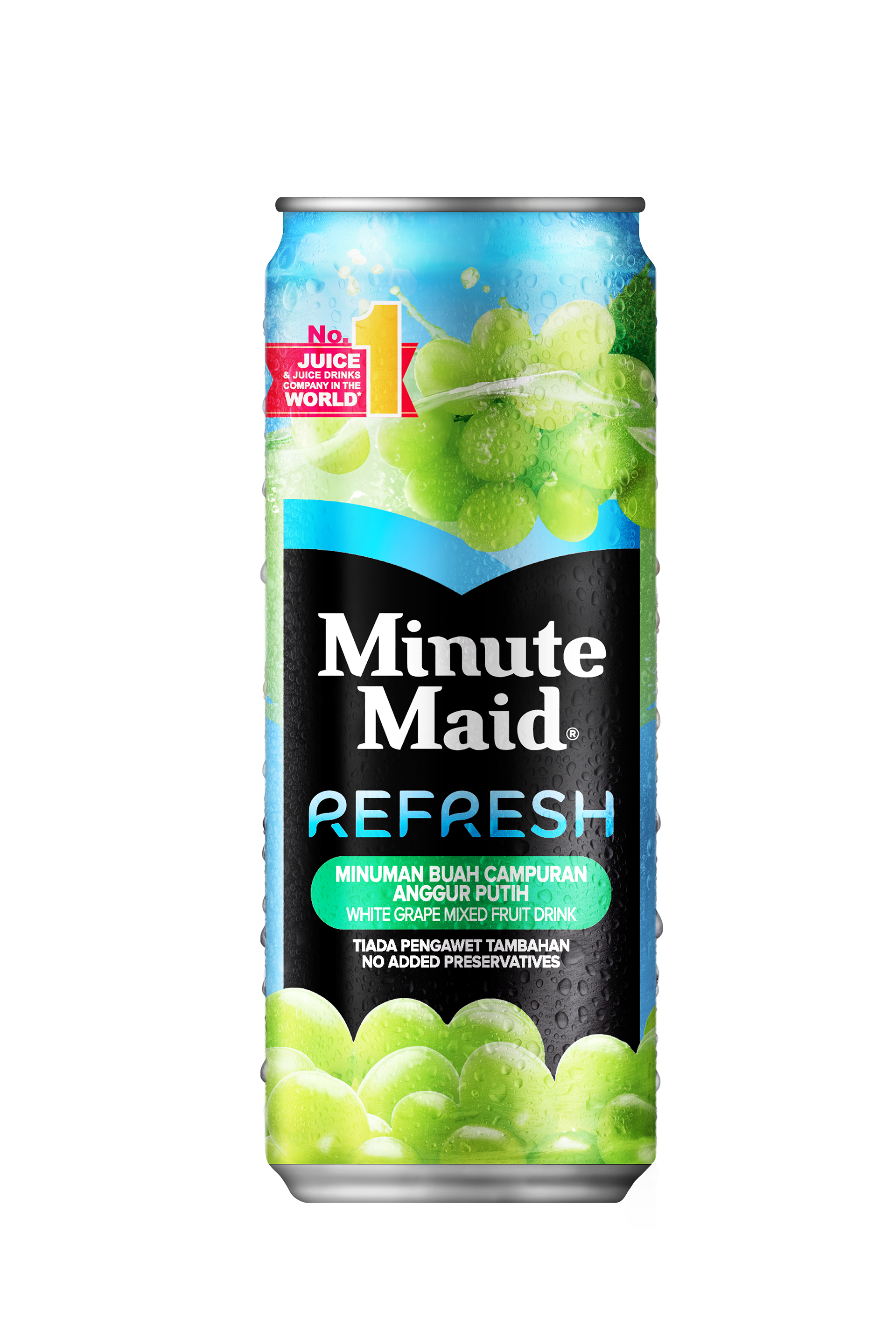
White Grape Mixed Fruit Drink (Minuman Buah Campuran Anggur Putih) — bright green grape clusters splashing from sky to base, with the green variant pill badge carrying the bilingual flavour callout.
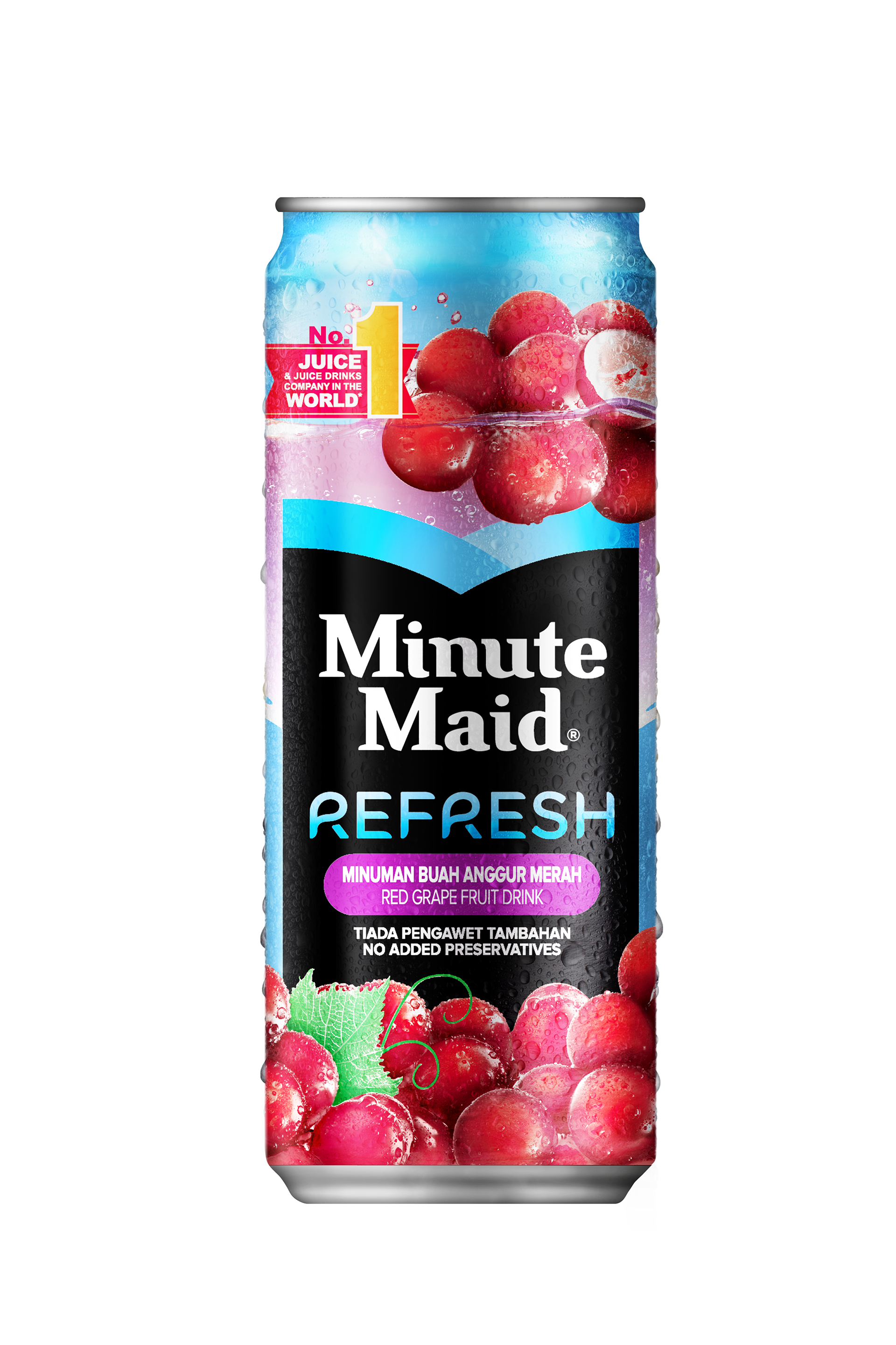
Red Grape Fruit Drink (Minuman Buah Anggur Merah) — deep red grape clusters splashing through pink-and-blue sky tones, with the magenta variant pill badge anchoring the SKU.
Beverage categories are uniquely physiological. The shopper isn't browsing a packaging concept — they're scanning a chiller looking for something that looks like what their body is asking for. Cold, wet, fizzy, fresh, fruity, energising, calming, indulgent. The pack's job is to look like the sensation the consumer is already chasing. Splash imagery, deep-saturated fruit colour, condensation gradient — every micro-detail on a beverage pack is engineered to bypass conscious decision and trigger the physiological reflex faster than a competitor's pack does. As a creative agency in Kuala Lumpur, we design beverage packaging across juice, juice drinks, ready-to-drink tea, sparkling water, dairy, functional drinks, and ambient beverages for FMCG and beverage brands across Malaysia and Southeast Asia.
Capabilities applied to this project: Minute Maid Refresh packaging, Minute Maid Malaysia packaging, Coca-Cola Malaysia packaging, Minute Maid juice drink packaging, juice drink can design, slim can packaging design, beverage packaging design Malaysia, fruit drink packaging design, condensation rendering packaging, photographic fruit composition packaging, multi-variant beverage range design, Bahasa Malaysia beverage packaging, Coca-Cola creative agency Southeast Asia, premium juice positioning packaging.
Got a beverage brief where the pack has to fire the thirst reflex before it does anything else? Let's design the chill.