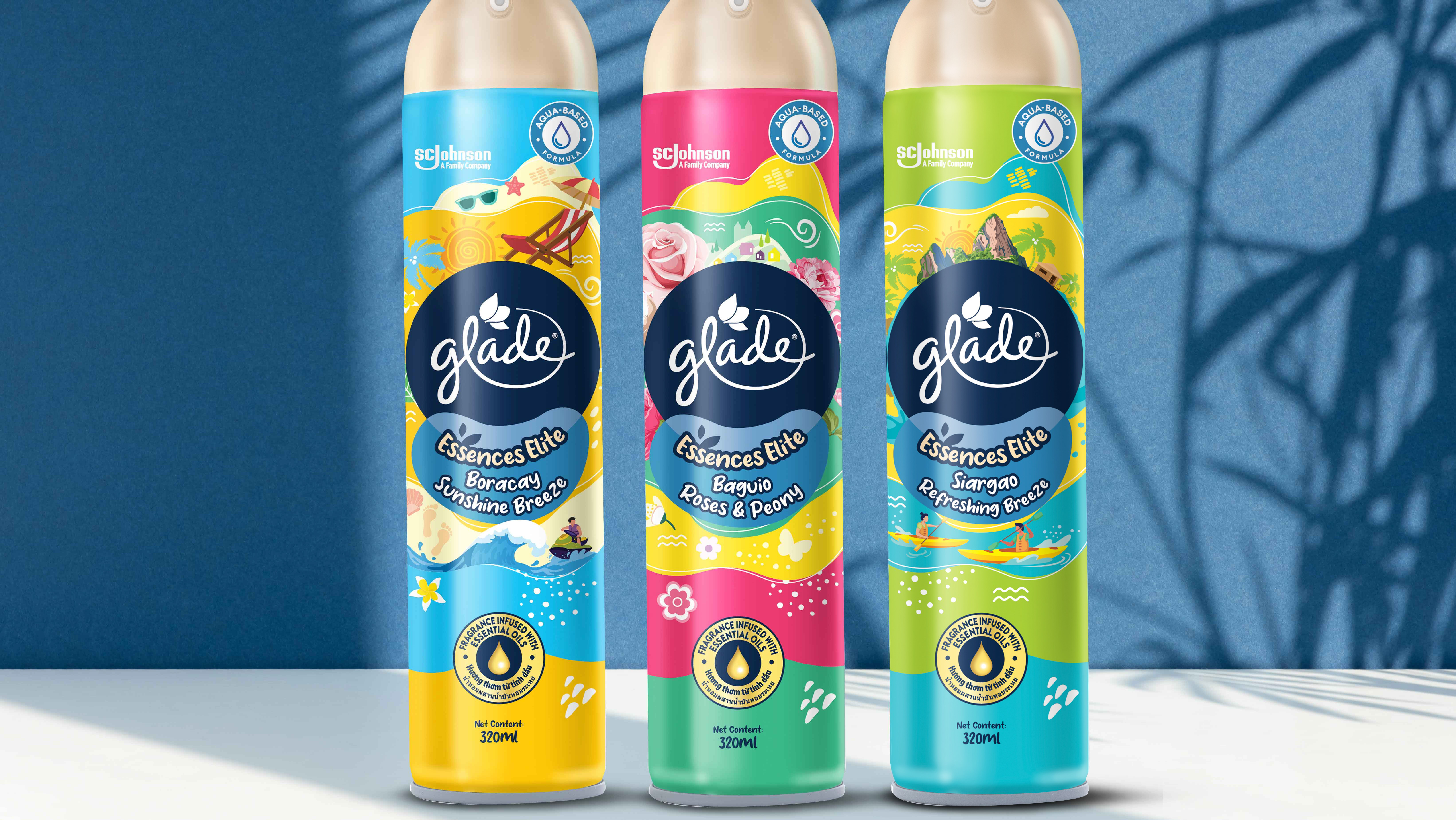
Client: Glade (SC Johnson) | Category: FMCG, Home Fragrance, Air Care, Scented Gel | Discipline: Packaging Design, Visual Brand Language (VBL) Development, Brand Architecture, Multi-Variant Range System | Scope: Ground-Up Pack Identity, Expressive Variant Colour Worlds, Hand-Drawn Botanical Illustration System, Premium-Youthful Repositioning, Range-Wide Design Language, Collectible Gel-Tub Format Design | Variants: White Roses & Peony, Crisp Green Apple & Peach, Bamboo Forest & White Tea | Format: Scented Gel Tub / Gel Air Freshener | Market: Malaysia | Agency: Laugh Contagious Communications, Kuala Lumpur
Air care is a category that defaults to function. Most packs lead with a fragrance name, a floral wash, and a freshness cue — enough to do the job, not enough to make anyone want the object on the shelf. For Glade's new premium range, Essences Elite, the brief refused that default: make the pack feel more premium, more modern, and more youthful than anything in the core range — a look that stands out at shelf and stands apart from every Glade pack that came before it.
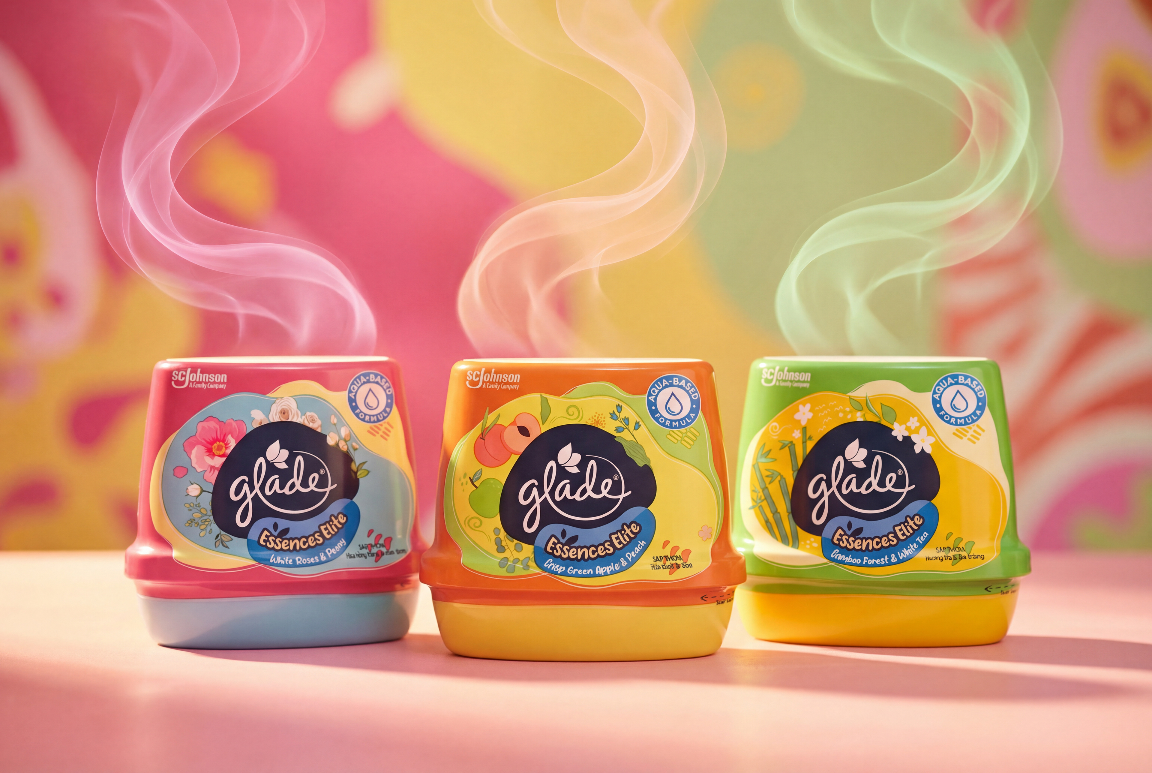
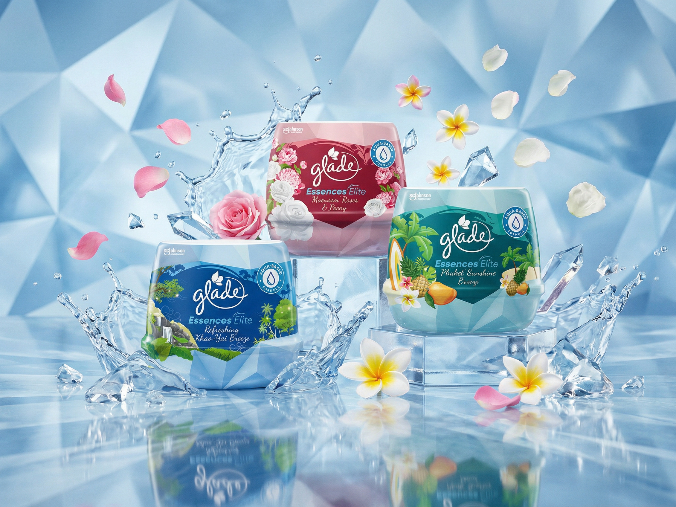
Glade Essences Elite — the full premium fragrance range, each variant cued by its own colour world and scent trail.
So we built something completely new. Essences Elite became the first Glade packaging globally to break away from the brand's established architecture — no inherited VBL, no rigid lockups, just a fresh canvas to build a new identity from scratch. We crafted a design language that heroes each fragrance with its own expressive colour world, a hand-drawn botanical illustration system, and a soft, modern palette that cues sophistication rather than utility. The gel tubs themselves are designed to feel collectible, lifestyle-driven, and display-worthy — elevating Glade into a space it had never played in before. Across all three variants, the same architecture holds the range together while colour and illustration differentiate each scent at a glance.
The result was a premium, contemporary pack that consumers instantly read as special — one so successful it became the reference design adopted across multiple ASEAN markets. A global brand-architecture first, created right here. As a creative agency in Kuala Lumpur, we treat premiumisation as a design problem solved on the pack, not a price tag added after it.
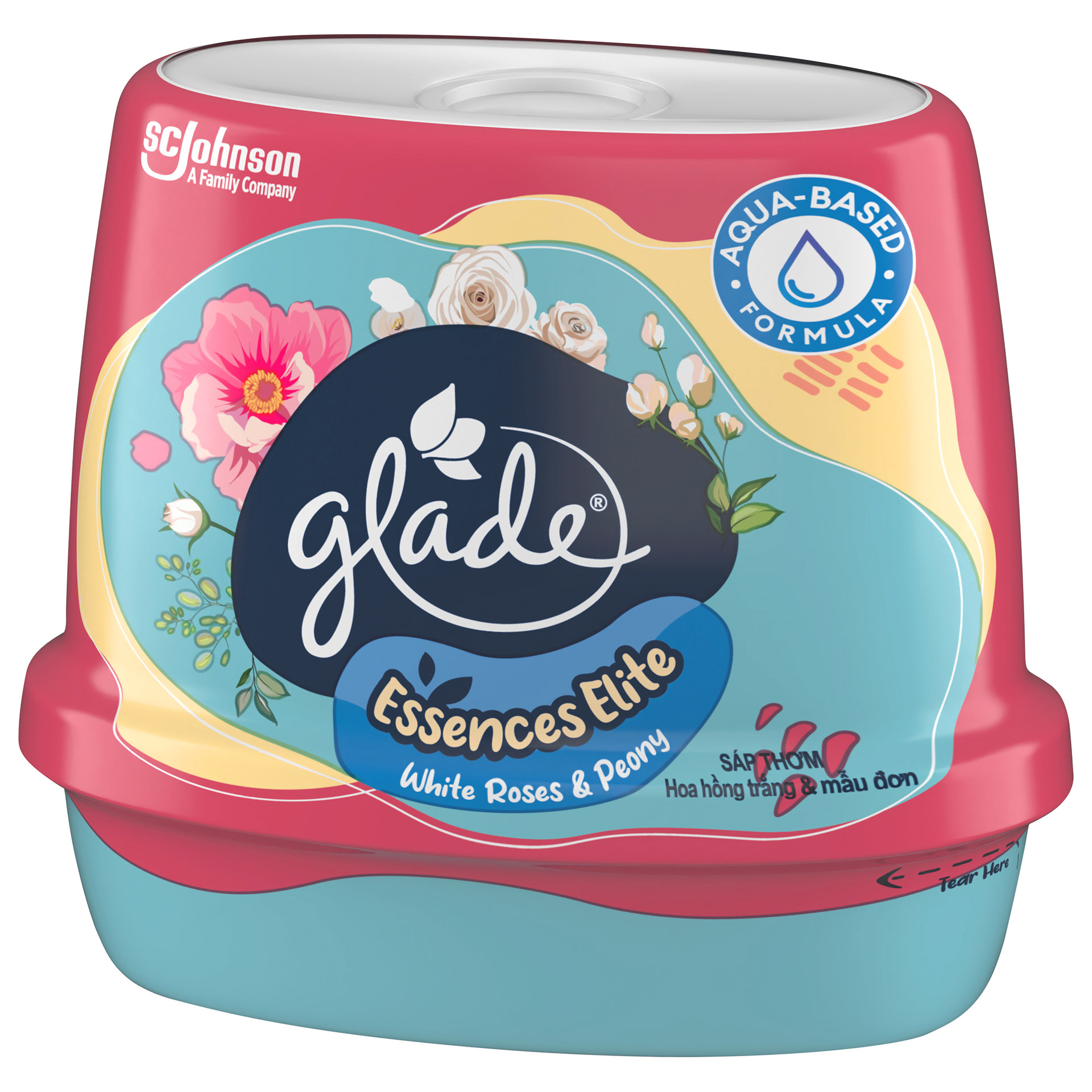
White Roses & Peony — soft florals and a modern palette signalling the range's premium, lifestyle-led shift.
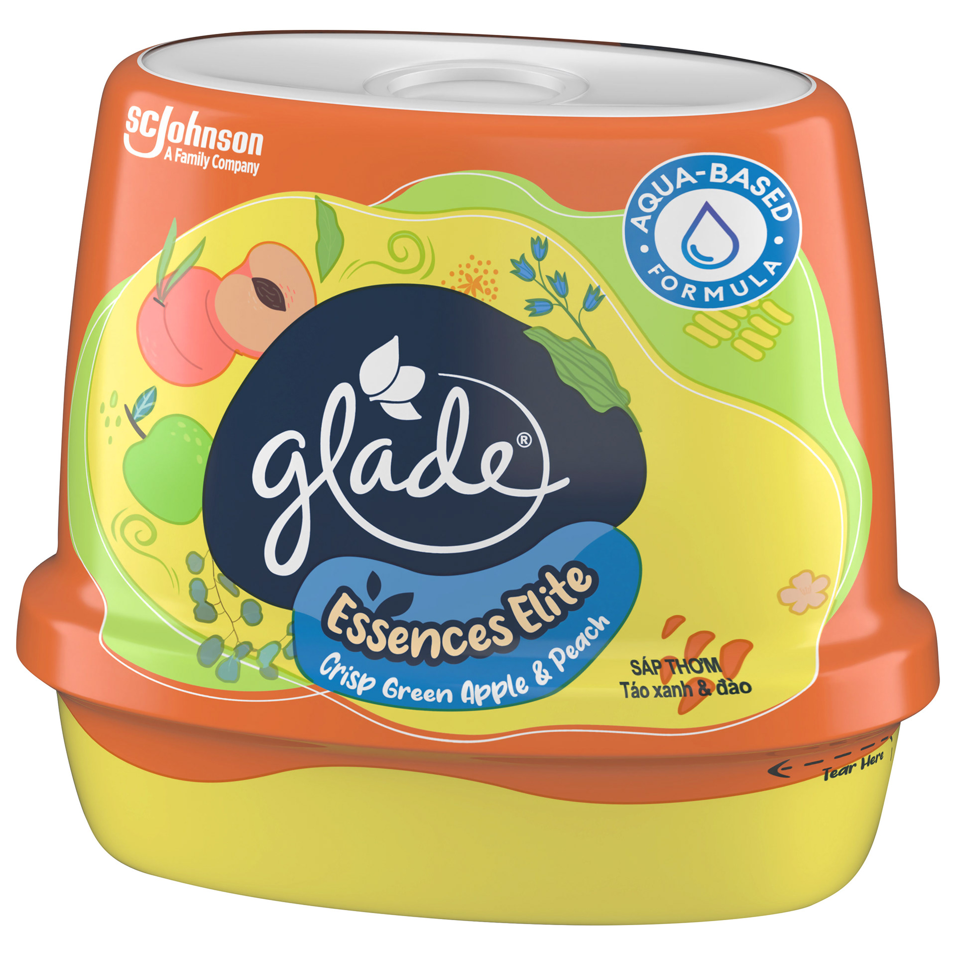
Crisp Green Apple & Peach — expressive, fruit-led illustration on a fresh, contemporary pack.
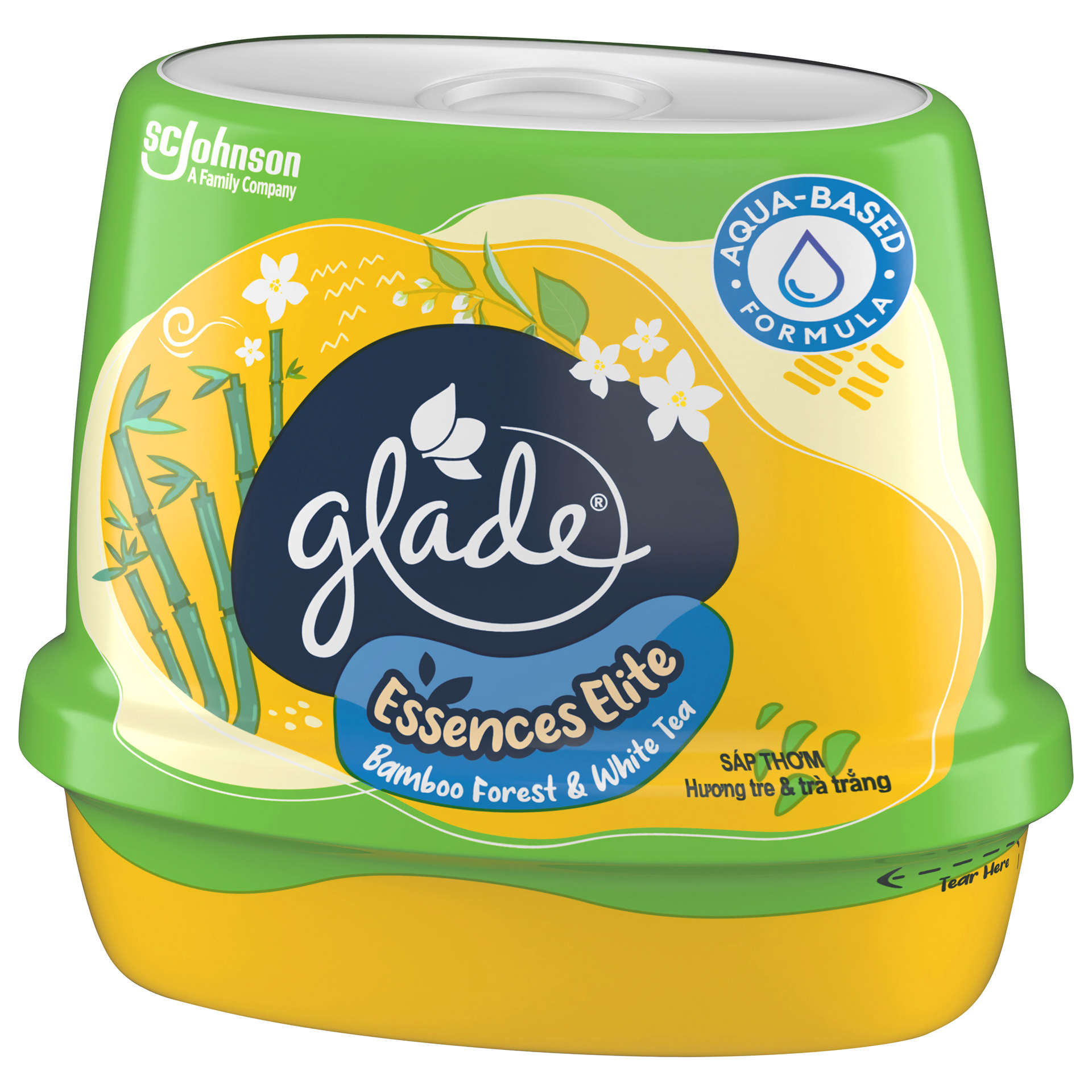
Bamboo Forest & White Tea — calm, premium cues within a system built to stand apart from every Glade pack before it.
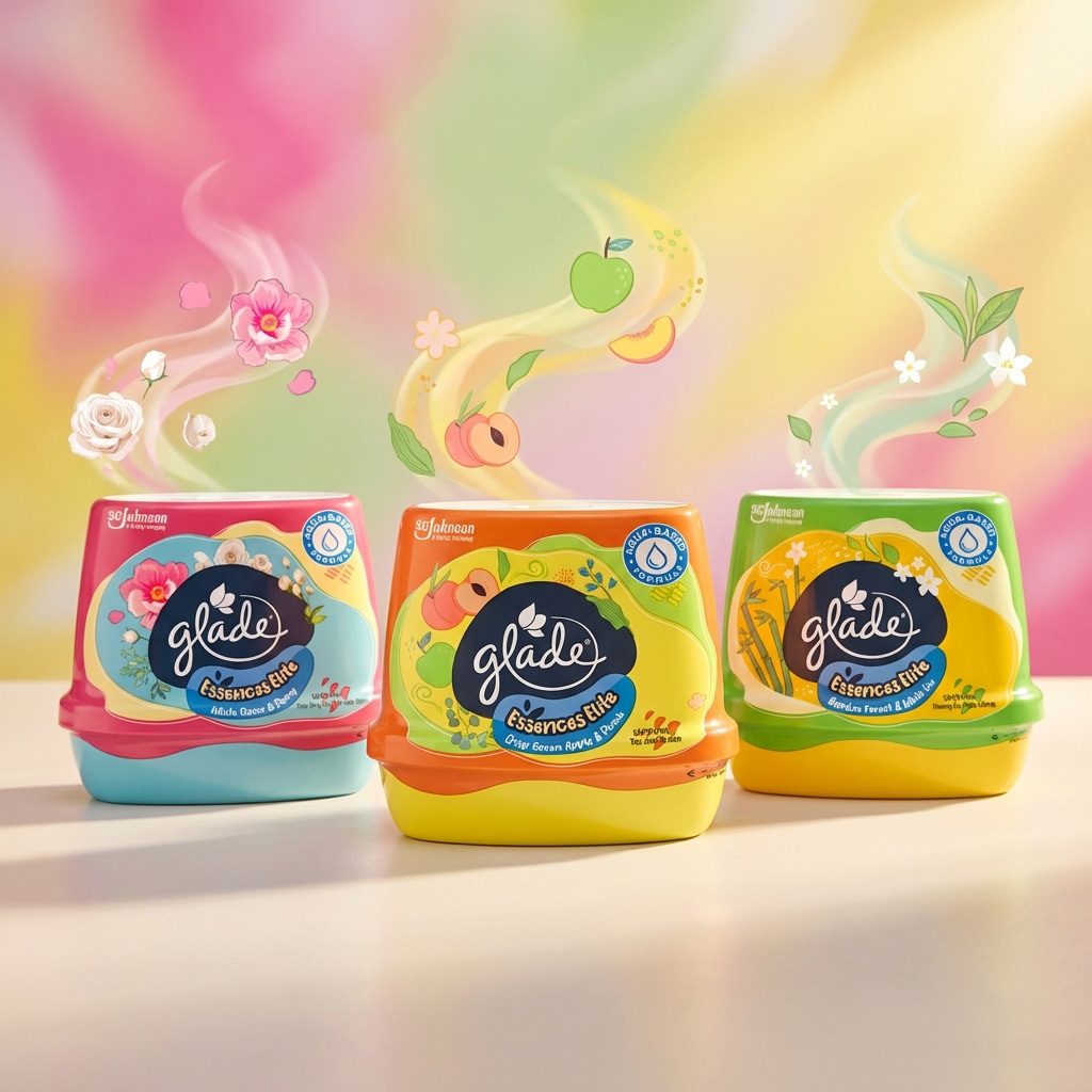
One design language across the range — hand-drawn botanicals and scent storytelling that make the tubs feel collectible and display-worthy.
Packaging isn't decoration applied to a finished product — it's the product's first and loudest brand statement, and often its entire brand architecture. Whether the brief is to launch a new identity, reposition an existing one upward, or build a visual brand language that has to hold across a whole region, the pack carries the weight: it has to signal price tier, fragrance story, and brand world in the moment before a shopper consciously reads anything. That's a structural and illustrative design problem, not a finishing touch. As a creative agency in Kuala Lumpur, we design packaging across air care, home care, personal care, beauty, food and beverage, and consumer categories — from single-pack identities to multi-variant range systems and full visual brand language development — for FMCG and lifestyle brands across Malaysia, Vietnam, and the wider Southeast Asia region.
Capabilities applied to this project: Glade Essences Elite packaging design, premium FMCG packaging design, air freshener packaging design, scented gel packaging Malaysia, SC Johnson packaging design, fragrance packaging design, visual brand language development, brand architecture design, hand-drawn botanical packaging, premium repositioning packaging, ASEAN regional packaging system, multi-market FMCG packaging.
Got a product that needs to break from its own category template — and own a premium shelf presence across a whole region? Let's design the canvas from scratch →