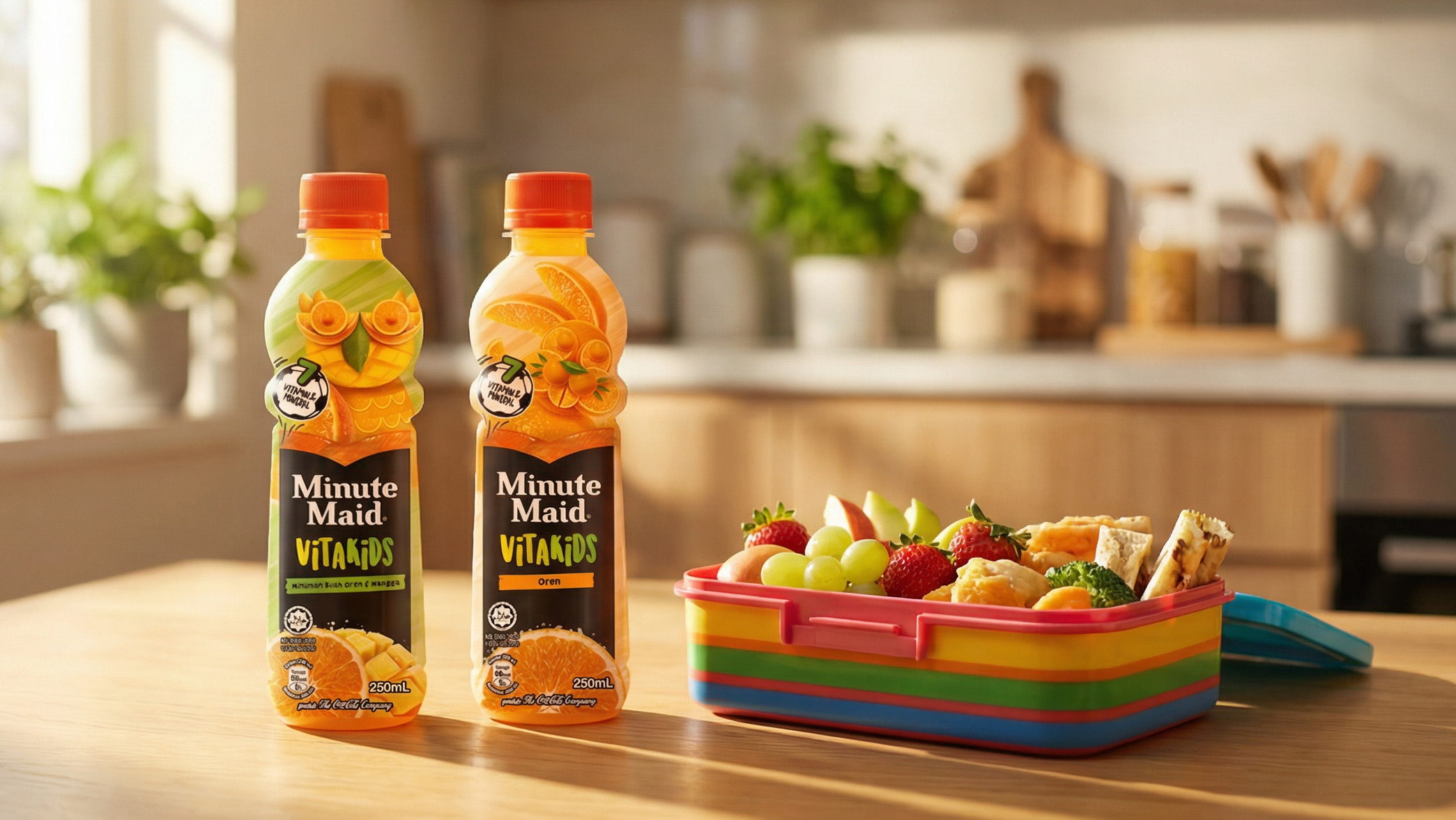
Client: Minute Maid Pulpy (The Coca-Cola Company) | Category: FMCG, Beverage, Juice Drinks, Pulp Juice Drink, Single-Serve PET | Discipline: Packaging Design, Packaging Refresh, Multi-Variant Label System, Beverage Pack Architecture | Scope: Label Redesign Across Three Variants, Real-Pulp Texture-Cue Design, Flying-Pulp Brand Graphic, Variant Colour-Coding System, Bulbous-Bottle Silhouette Heroing | Variants: O'Mango (Mixed Fruit Drink), Orange (Fruit Drink), Tropical (Mixed Fruit Drink) | Format: 300mL Single-Serve PET Bottle | Market: Malaysia | Agency: Laugh Contagious Communications, Kuala Lumpur
Pulpy juice drinks don't sell on flavour alone, they sell on texture. The entire promise of the sub-brand is real pulp: actual fruit bits you can see suspended in the bottle and feel on the first mouthful. That puts an unusual demand on the pack, because texture is a sensory claim the shopper can't taste at the chiller. It has to be telegraphed visually, instantly, and convincingly before purchase. Minute Maid Pulpy already owns one of the most distinctive structural assets in the category: its bulbous, double-bulb bottle silhouette, a proprietary shape that signals "this isn't a flat juice drink" before a single word is read. The refresh brief was to make the label work as hard as the bottle and modernising the design while amplifying the real-pulp story at shelf glance.
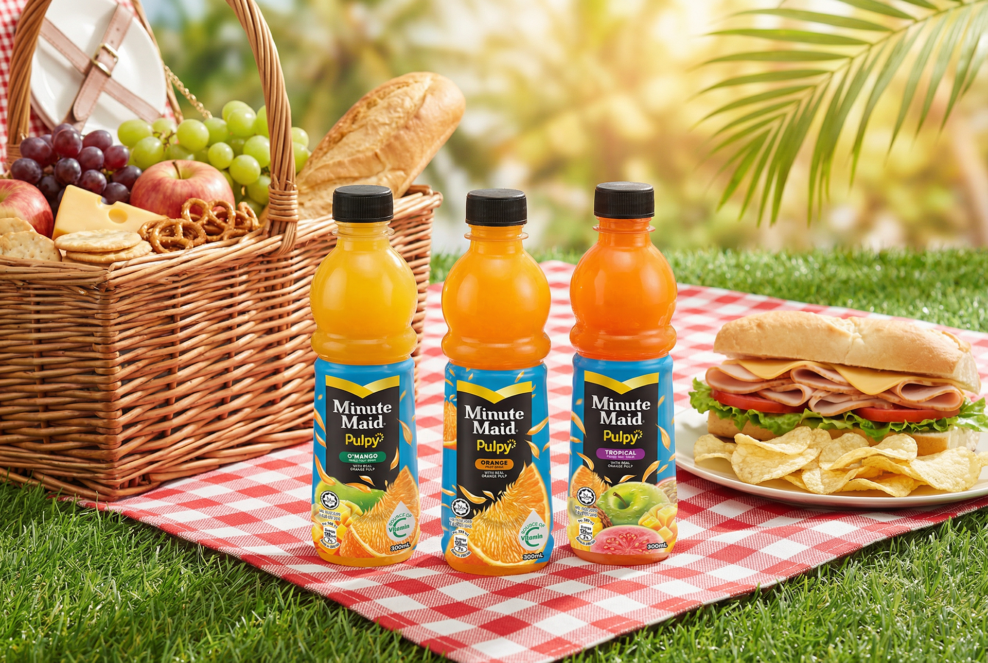
Minute Maid Pulpy in its natural habitat — an everyday outdoor refreshment moment built around real-pulp juiciness.
We built the system around that pulp cue. A field of flying orange segments and pulp pieces sweeps across each label, animating the texture promise and visually echoing the real pulp inside the bottle. A deep blue label ground makes the fruit colours pop and lifts the range above the white-and-sunny default of the juice-drink aisle, while the black-and-yellow chevron Minute Maid lockup anchors Coca-Cola brand authority at the top of every pack. Each variant takes a colour-coded name pill — O'Mango in green, Orange in orange, Tropical in purple — so the three read as one confident range at shelf glance while differentiating by fruit in an instant. Source of Vitamin C and Halal lockups close the trust loop for Malaysian shoppers. The design positions Pulpy as easy, uplifting, naturally refreshing enjoyment. As a creative agency in Kuala Lumpur, we treated the pulp as the hero — and designed everything else to make the eyes believe it before the mouth does.
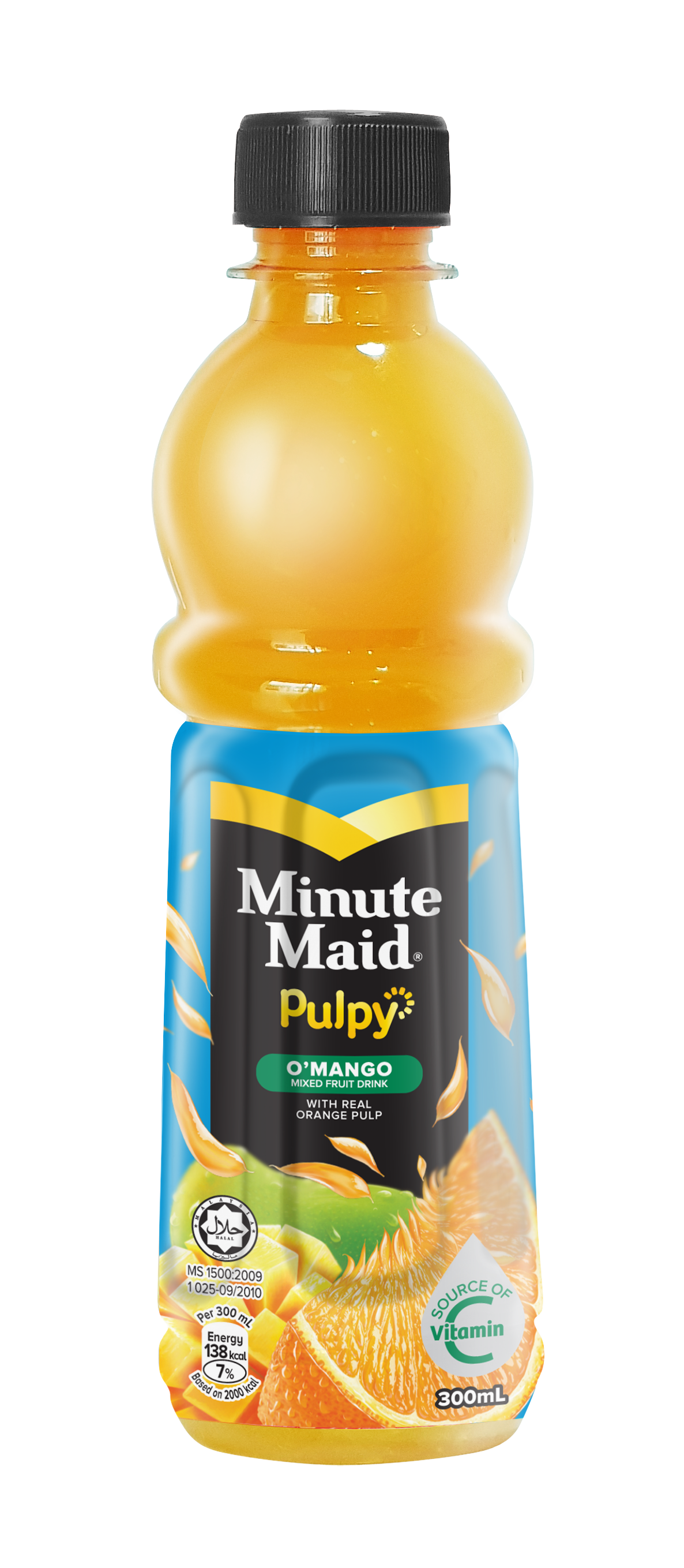
O'Mango — a mixed fruit drink with real orange pulp, colour-cued green within the shared label system.
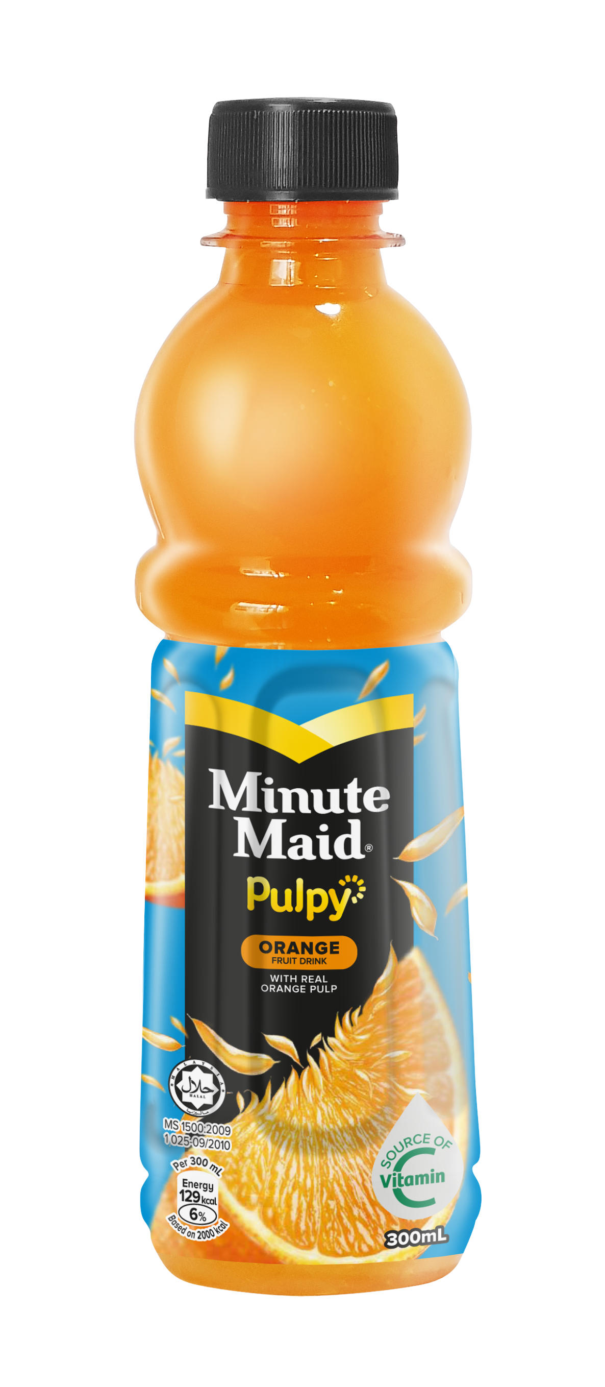
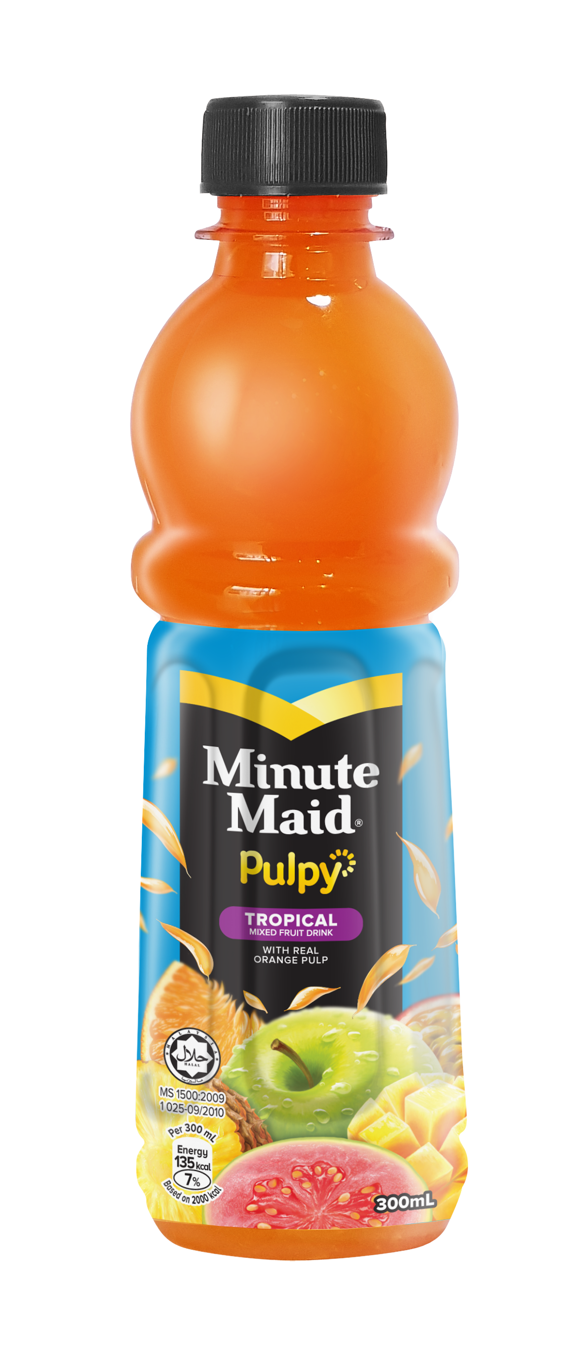
Orange — the core variant, flying-pulp graphics amplifying the real-pulp texture promise.
Tropical — a mixed fruit blend, purple-cued, instantly distinct while the brand block holds together.
Refreshing an established brand is harder than launching a new one. The equity already lives in the shopper's memory — the colour, the silhouette, the lockup, the shelf block they reach for on autopilot — and the wrong refresh can quietly erase years of built-in recognition in pursuit of looking current. The discipline is knowing exactly which assets are sacred and which are free to evolve: protect the cues that trigger instant recognition, sharpen everything else for modernity, clarity, and stronger shelf standout. Done right, a refresh feels new and familiar at once — the shopper notices the pack looks better without ever feeling they've lost the brand they trust. As a creative agency in Kuala Lumpur, we design packaging refreshes and redesigns across beverage, food, home care, personal care, and beauty — protecting brand equity while sharpening shelf impact — for FMCG and consumer brands across Malaysia and Southeast Asia.
Capabilities applied to this project: Minute Maid Pulpy packaging, Minute Maid packaging design, Coca-Cola Malaysia packaging, juice drink packaging design, pulp juice packaging design, beverage packaging refresh, PET bottle label design, multi-variant beverage range design, real-pulp texture cue design, packaging refresh Malaysia, FMCG beverage packaging Kuala Lumpur, brand equity refresh packaging.
Got an established pack that needs to feel current without losing the recognition you've spent years building?