Client: Lady's Choice (Unilever) | Category: FMCG, Food, Spreads, Peanut Butter | Discipline: Packaging Design, Multi-Variant Pack System Revamp | Scope: Full Range Pack Redesign Across Four Variants, Variant-Specific Colour Coding, Swirl-Led Appetite Illustration System, Per-Variant Claim Architecture, Bahasa Malaysia Ingredient Transparency Layer, Front-of-Pack Hierarchy | Range: Creamy Peanut Butter, Chunky Peanut Butter, Choco Peanut Butter, Grape Peanut Butter | Market: Malaysia | Agency: Laugh Contagious Communications, Kuala Lumpur
A food pack has a simple commercial job most agencies forget: it has to make the shopper hungry. Not informed, not impressed, not flattered. Hungry. Everything else — the claims, the ingredient lists, the brand pedigree — only matters once that first reflex has already fired. Most peanut butter packs in this category default to a static product silhouette and a generic family-friendly claim. That doesn't trigger anything. What does trigger something is showing the product in motion — the scoop being pulled, the swirl mid-spread, the spoon coming out heavy with the next bite. Show the use of the product, not the product, and the pack starts doing the work it's supposed to.
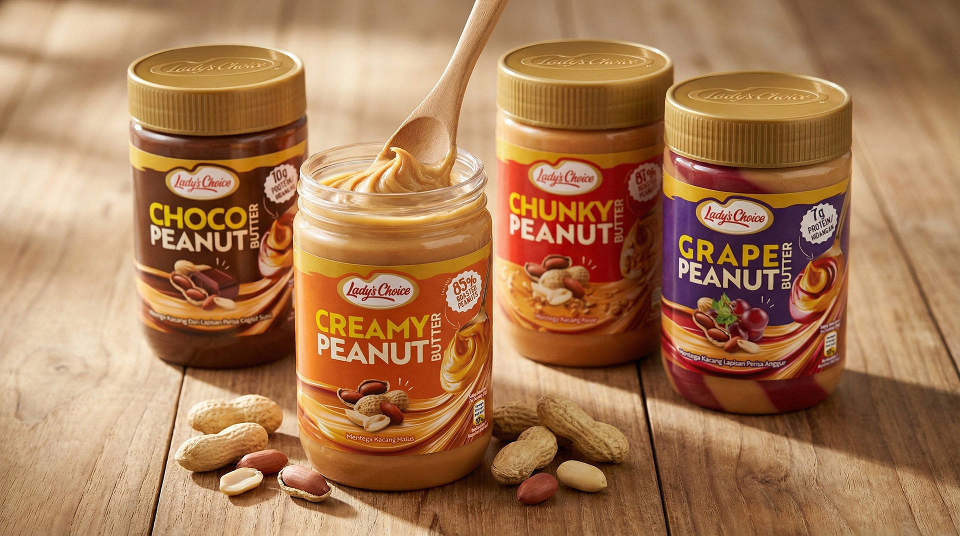
The four-variant range — Creamy, Chunky, Choco, Grape — anchored on warm wood with real peanuts scattered and an open jar mid-scoop, framing Lady's Choice as honest, kitchen-table, family-pantry food.
For Lady's Choice Peanut Butter's pack revamp, we built every front-of-pack around that one principle. The unifying device across the entire range is a vivid "swirl" illustration system — peanut butter mid-scoop, mid-spread, mid-pour, mid-mix-with-grape — so each pack signals the act of eating before the shopper even reads a word. A flavour-coded colour banner architecture (orange for Creamy, red for Chunky, chocolate-brown for Choco, deep purple for Grape) gives the shopper instant variant navigation across the shelf. Beneath every English headline, Bahasa Malaysia ingredient descriptors (Mentega Kacang Halus, Mentega Kacang Kasar, Mentega Kacang Dan Lapisan Perisa Coklat Susu, Mentega Kacang Lapisan Perisa Anggur) do the local trust work the English banner alone can't. The pack revamp lives at the centre of the wider Wajah Baharu tapi Nutty-licious yang sama refresh — and as a creative agency in Kuala Lumpur, we designed the new pack to be the thing the refresh was actually built around.
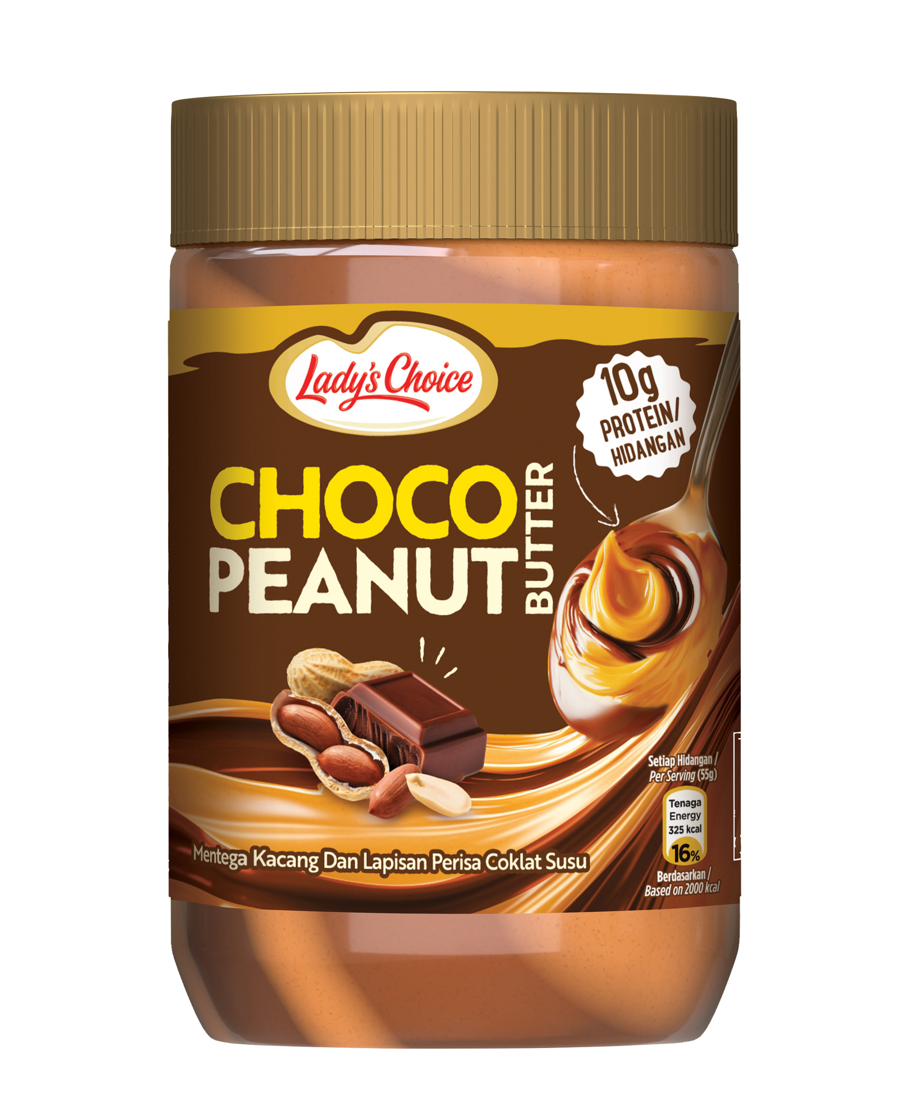
Choco Peanut Butter — chocolate-brown banner, 10g Protein per Serving, with the swirl illustration showing the peanut-and-chocolate cross-section mid-pour.
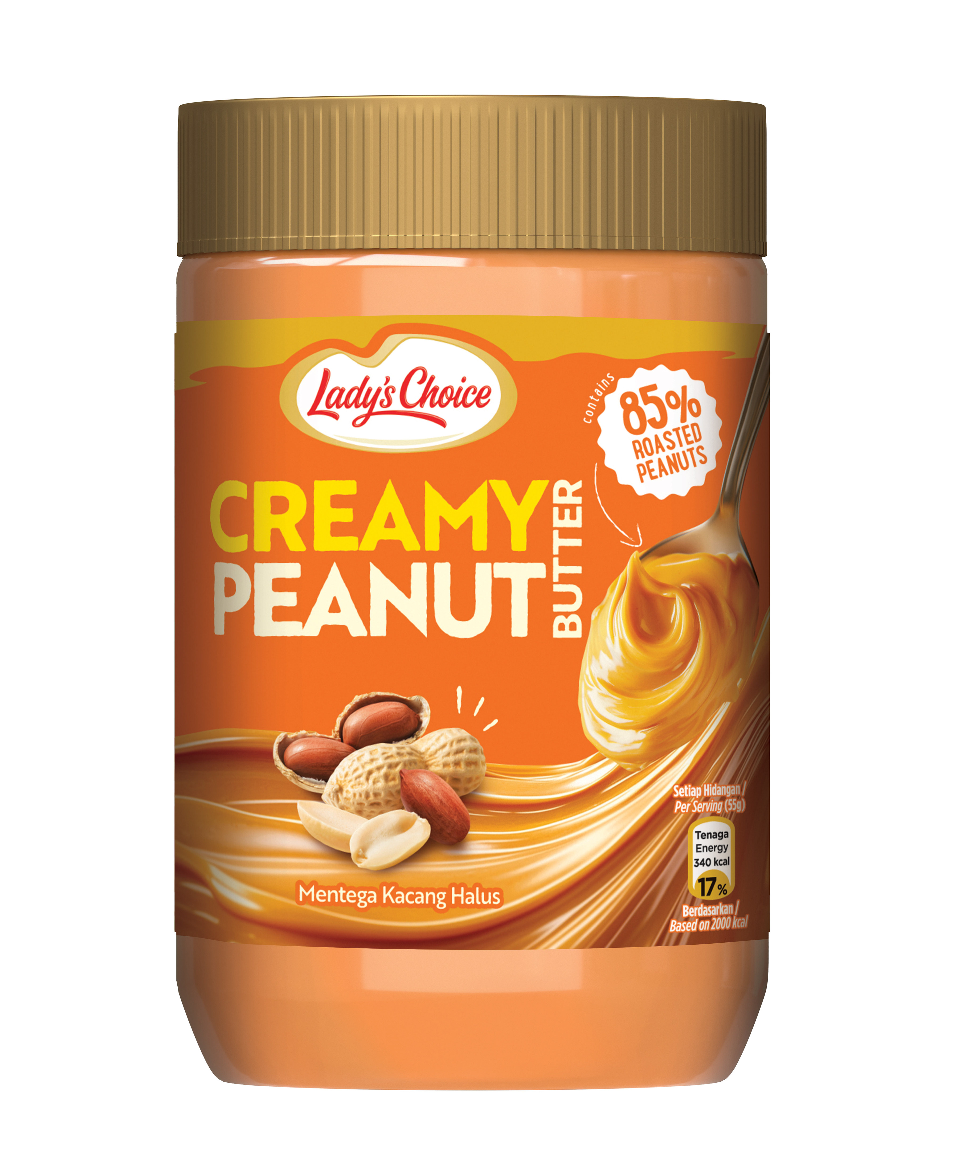
Creamy Peanut Butter — orange banner, 85% Roasted Peanuts honest-ingredient hero claim, with the smooth swirl illustration showing the spoon-pull texture in motion.
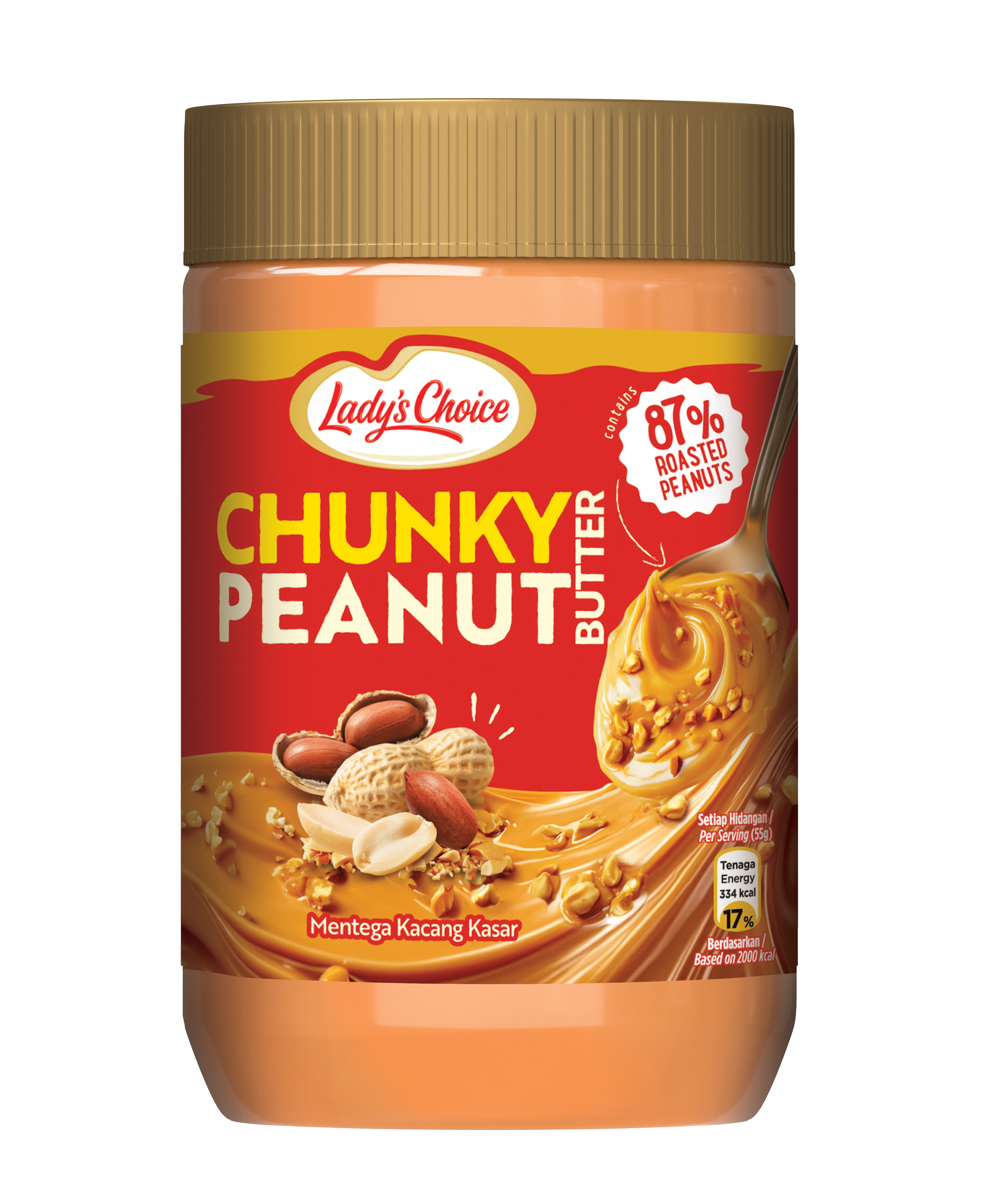
Chunky Peanut Butter — red banner, 87% Roasted Peanuts claim with chunky peanut-pieces illustration showing the coarse texture (Mentega Kacang Kasar).
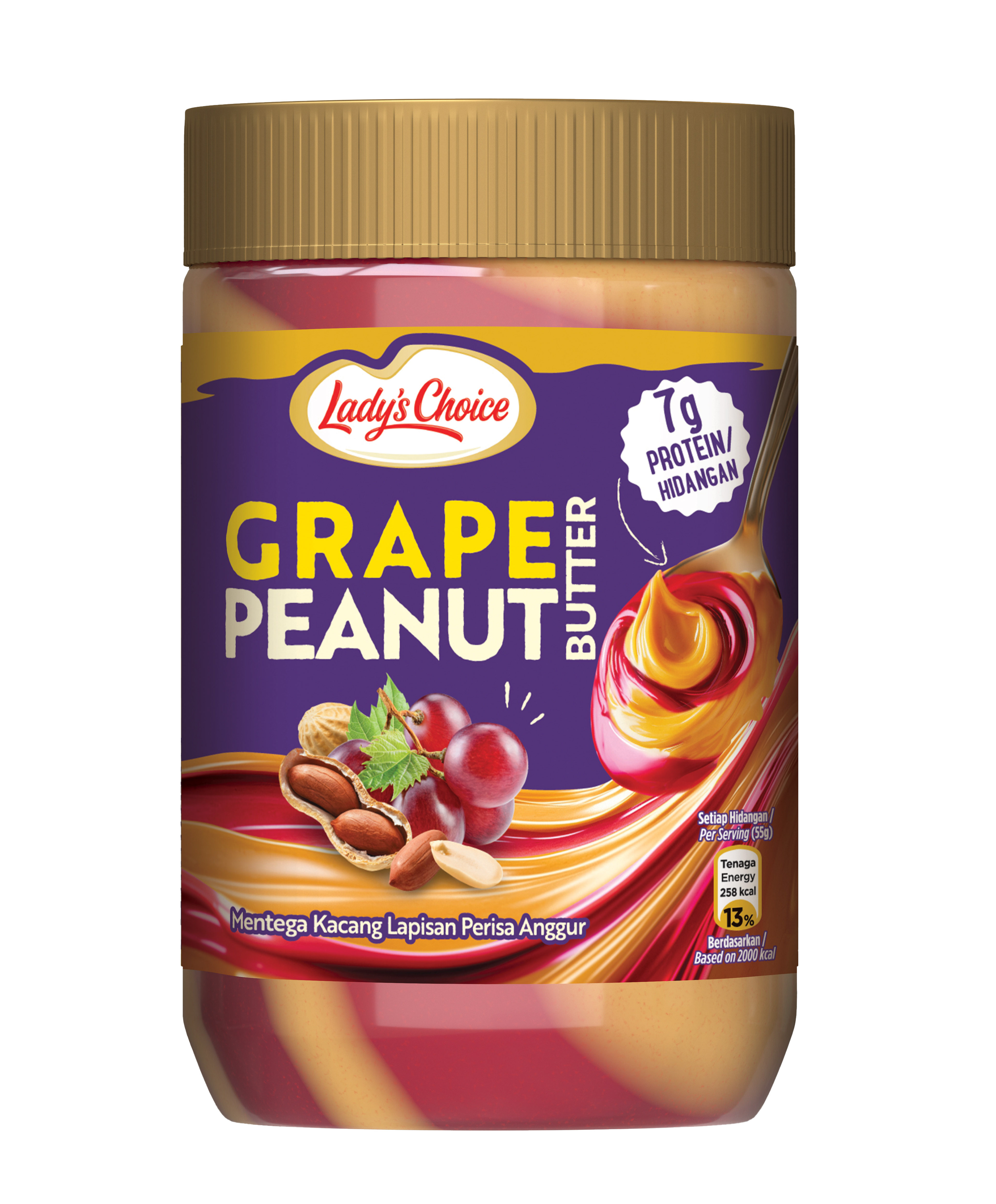
Grape Peanut Butter — deep-purple banner, 7g Protein per Serving, with the peanut-and-grape swirl illustration showing the marbled cross-section of the two layers (Mentega Kacang Lapisan Perisa Anggur).
Most ranges run a single blanket claim across every variant — family-friendly, natural, delicious, trusted. Convenient for the brief, weak for the shopper. The sharper move is to ask the harder question variant by variant: what is the most honest thing this specific SKU has to say? On a plain product, it's an ingredient percentage. On a flavour-added variant, it's a nutritional credential. On a premium tier, it's an origin. On an indulgent line, it's an experience claim. Each variant gets the truth that flatters it most — and the range, taken together, reads as honest rather than uniformly marketed. As a creative agency in Kuala Lumpur, we design food packaging, multi-variant pack systems, appetite-led front-of-pack architecture, and claim systems for FMCG, food, beverage, and spreads brands across Malaysia and Southeast Asia.
Capabilities applied to this project: Lady's Choice packaging design, Lady's Choice peanut butter packaging, Lady's Choice pack revamp, Unilever Lady's Choice packaging, food packaging design Malaysia, peanut butter packaging design, spreads pack design, multi-variant pack system design, appetite-led food packaging, swirl illustration pack design, variant-specific claim architecture, Bahasa Malaysia food packaging, ingredient-transparent pack design, food packaging refresh, Unilever creative agency Malaysia.
Got a food range whose pack should be making people hungry — not informed? Let's redesign the swirl.