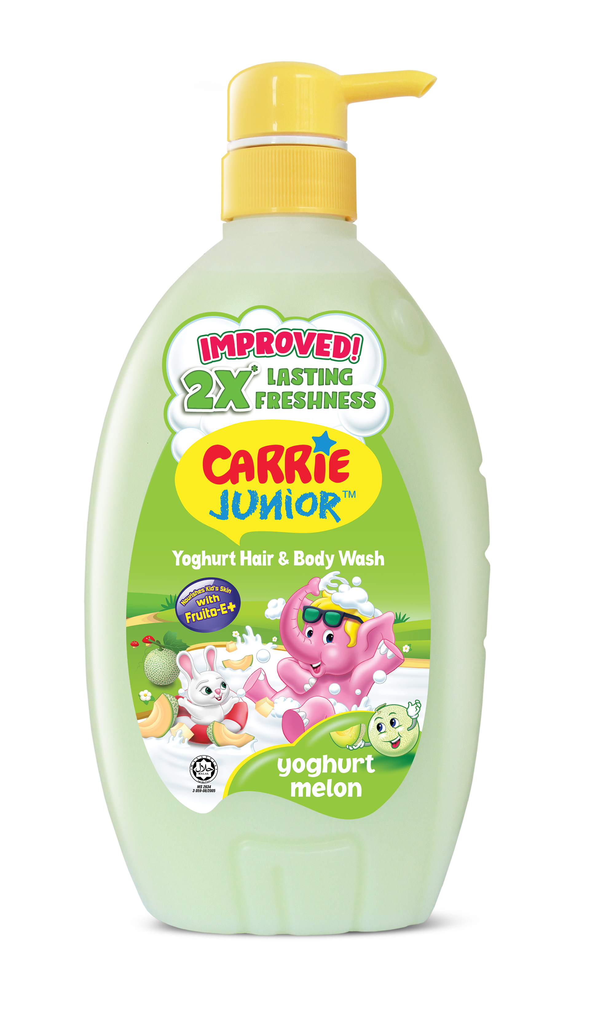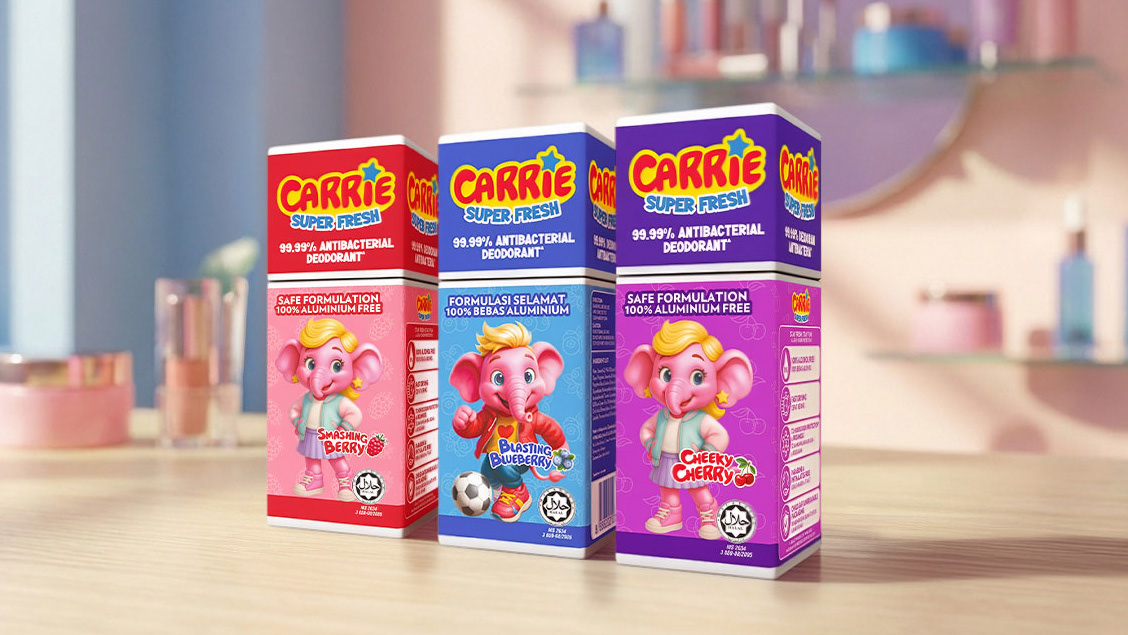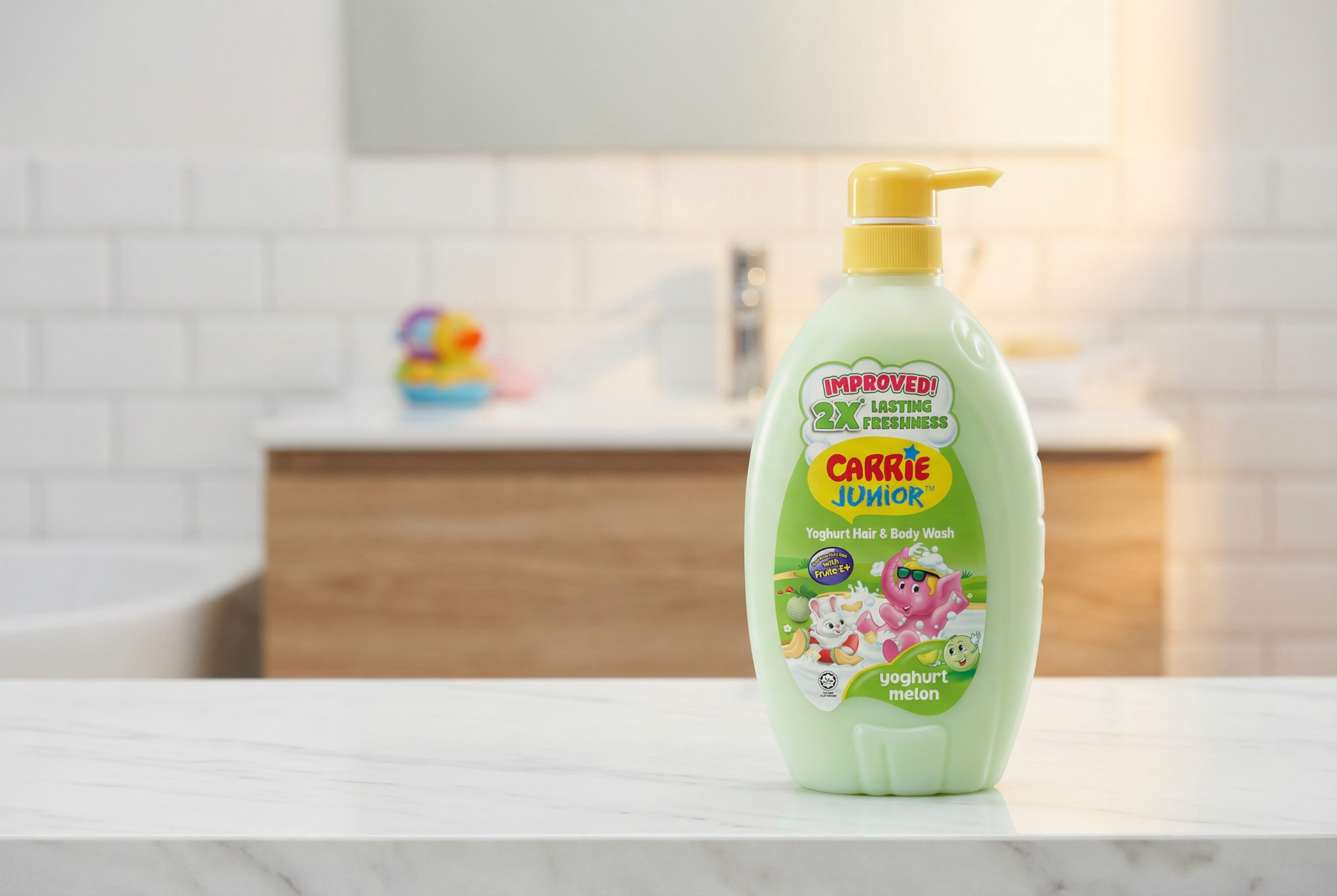
For the launch of Carrie Junior Yoghurt Melon, we designed a refreshed packaging that brings together fun, freshness, and gentle care—core to the Carrie Junior brand promise. The visual language is bright, friendly, and instantly kid-appealing, featuring playful character illustrations, creamy yoghurt cues, and juicy melon elements to clearly communicate scent and benefit at first glance. The soft pastel green bottle reinforces mildness and freshness, while the improved “2X lasting freshness” claim is highlighted prominently to build parent confidence. Overall, the packaging balances childlike joy with parental reassurance, helping the new variant stand out strongly on shelf while staying true to the trusted Carrie Junior identity.