Client: Glade (SC Johnson) | Campaign: "Smells Like a Vacation" / Spraycation | Discipline: Packaging Design, Multi-Format Range (Aerosol + Gel), Destination Pack Illustration | Variants: Baguio (Roses & Peony), Boracay (Sunshine Breeze), Siargao (Refreshing Breeze) | Format: 320ml Aerosol + Scented Gel | Market: Philippines | Agency: Laugh Contagious Communications, Kuala Lumpur
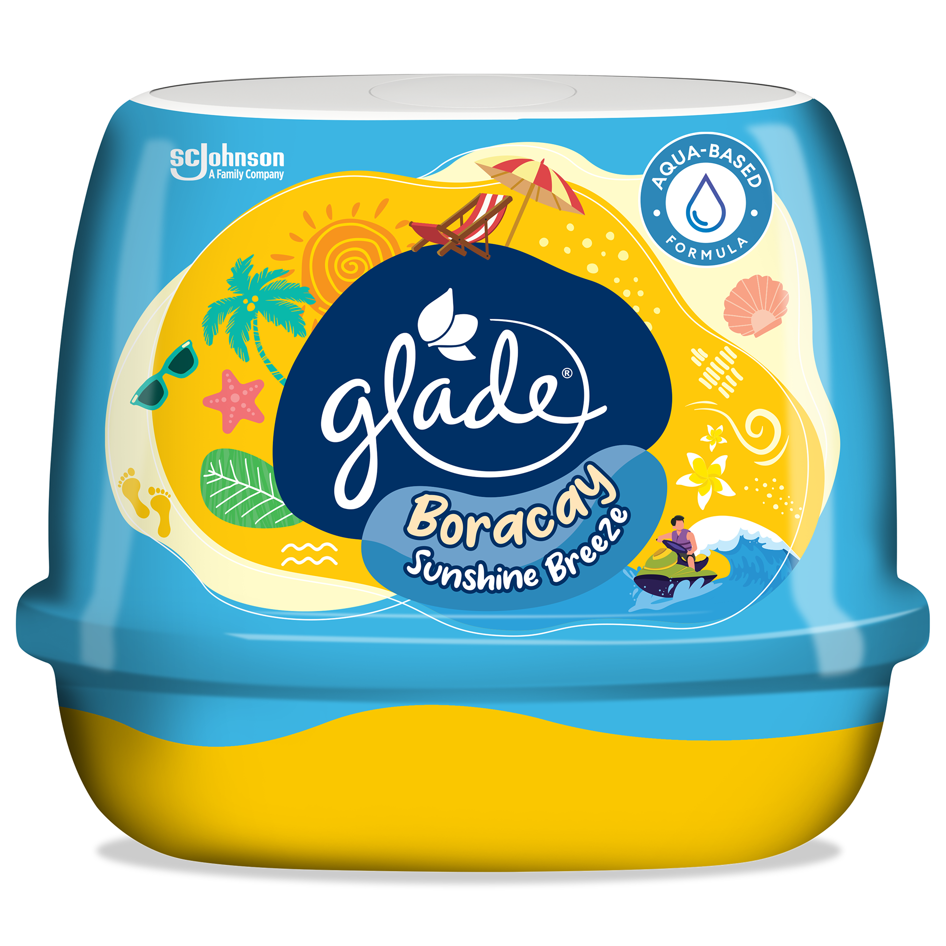
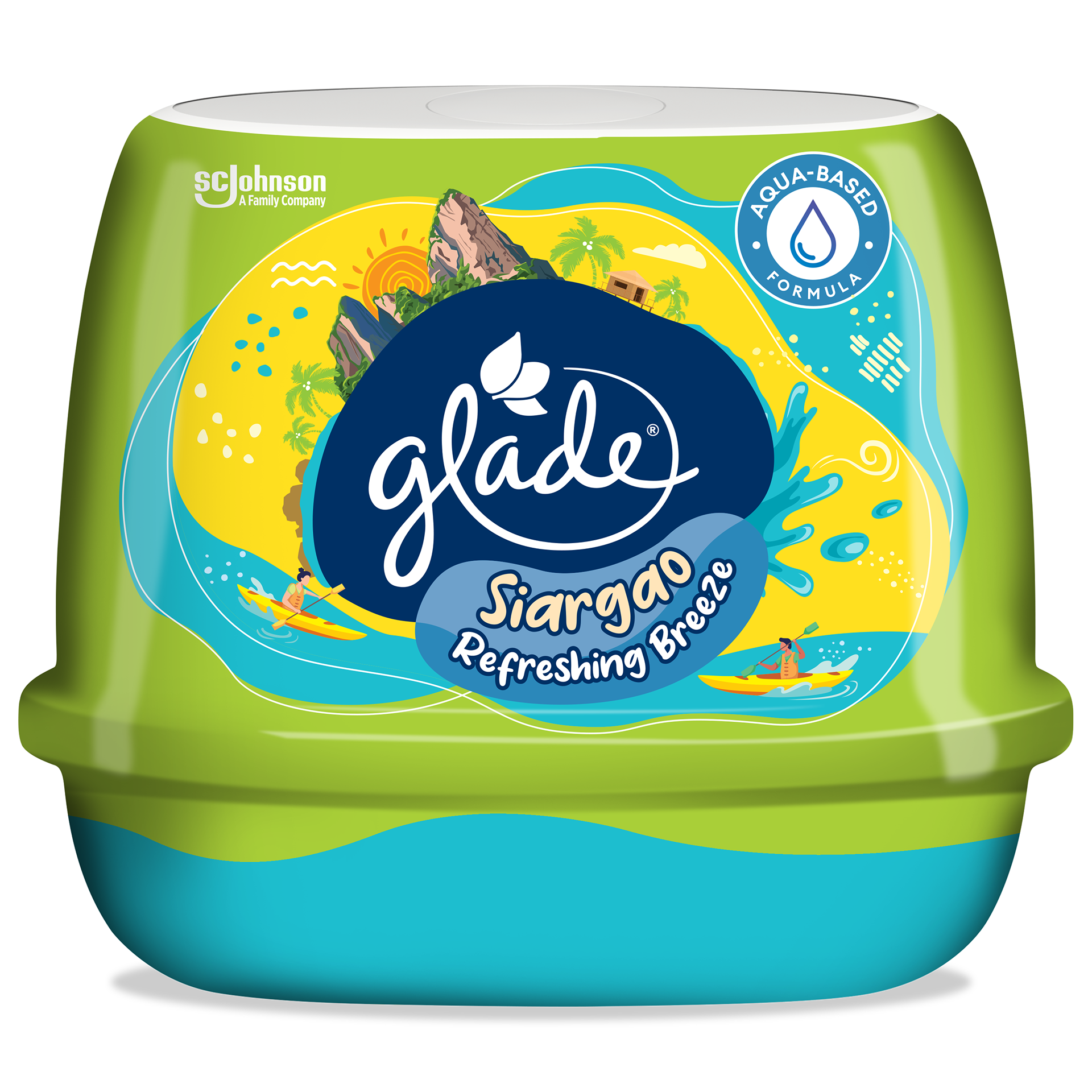
The hardest thing about a fragrance pack is that the product itself is invisible — and here the brief made that harder still. Each variant isn't named for a scent note but for a place: Baguio, Boracay, Siargao, three getaways Filipinos already carry a feeling about. So the pack has to do the translating, turning an abstract "vacation scent" into a destination a shopper can see, recognise, and want before they've sprayed a thing. We solved it by illustrating each variant as its own complete scene wrapping the pack — Boracay's sunlit beach with parasol and surf, Baguio's rose-filled highland town, Siargao's palm-and-mountain coastline with kayakers — colour-coded so the three read instantly as one range while splitting by destination at a glance.
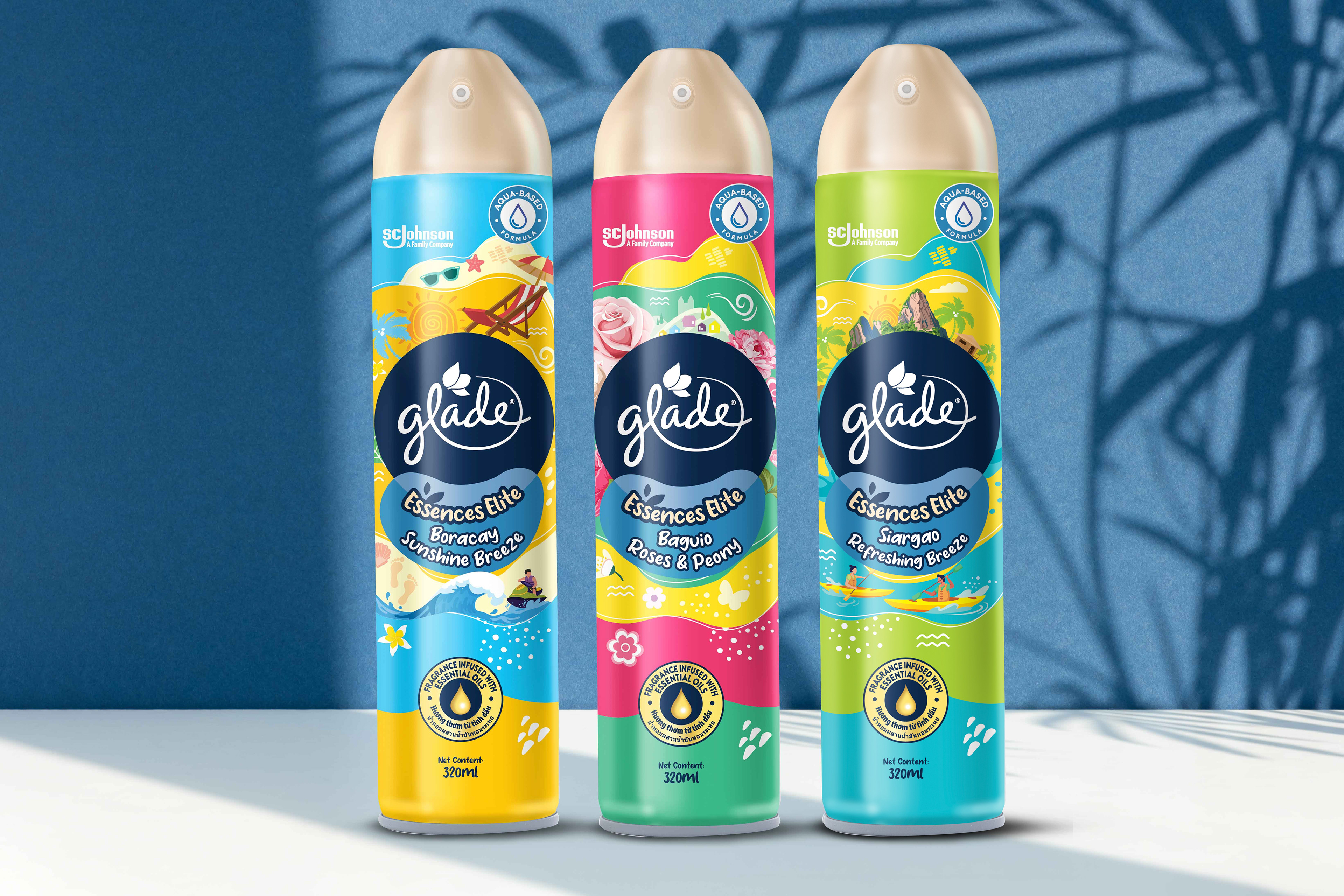
The aerosol range — each destination illustrated as its own scene, colour-coded but unmistakably one Spraycation family.
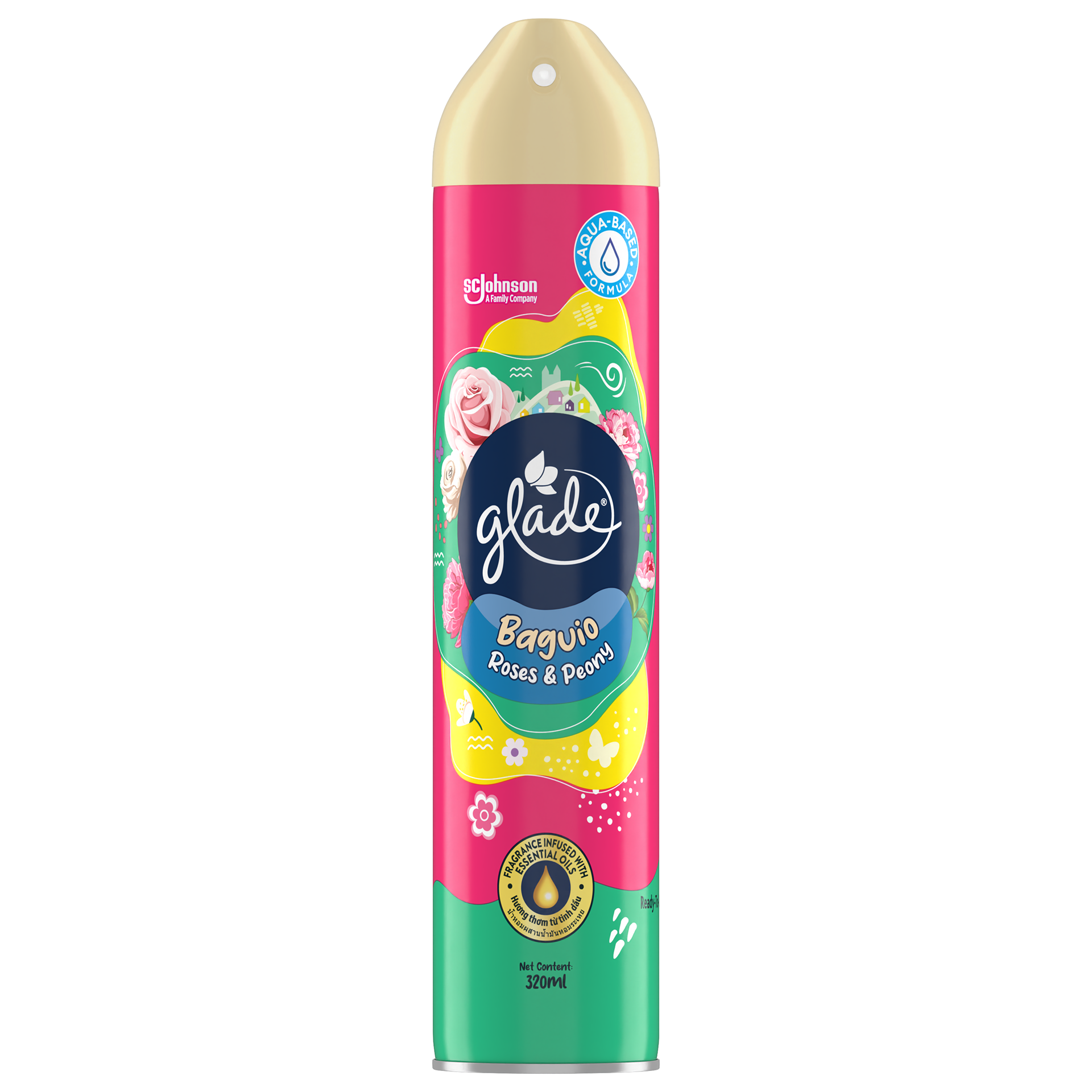
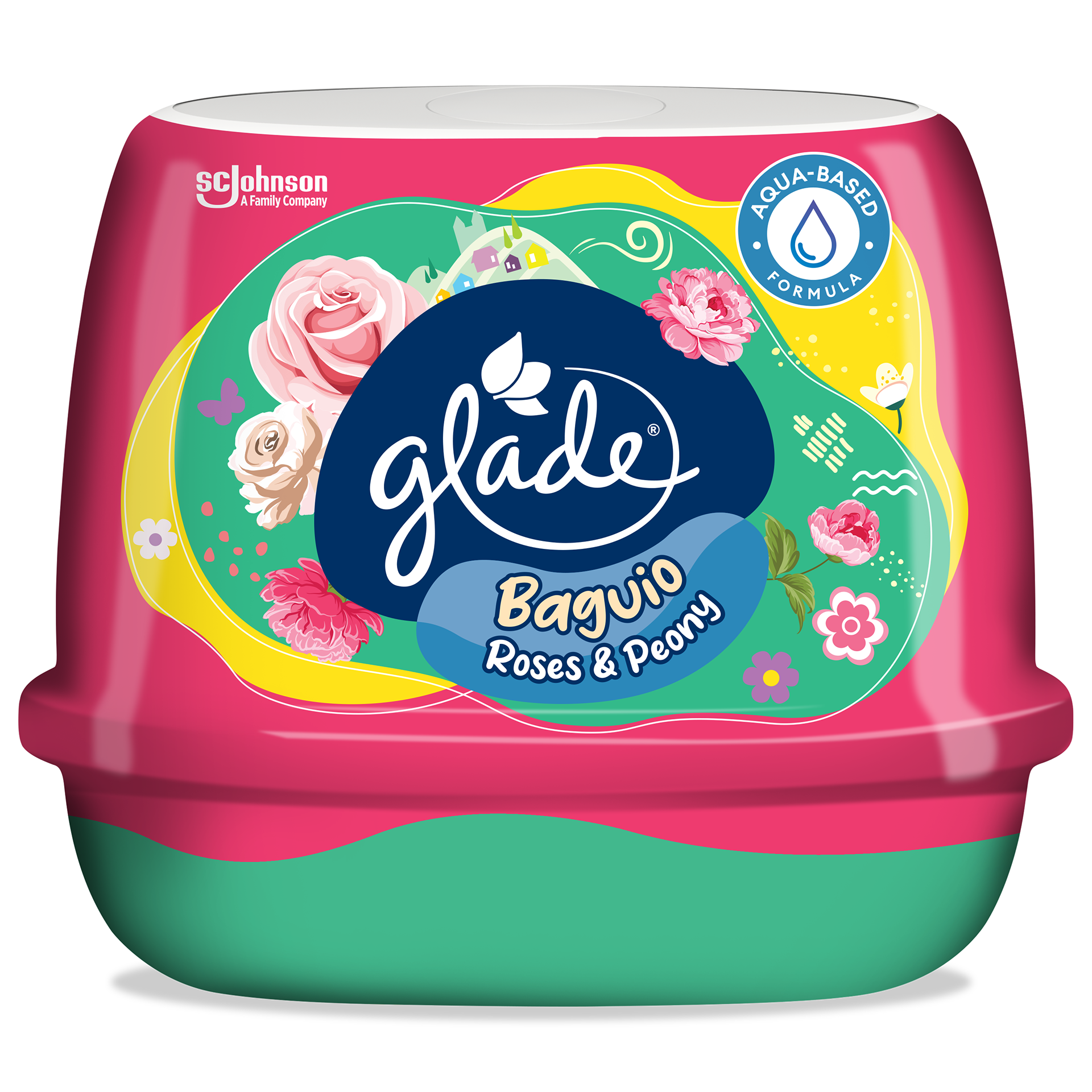
Baguio Roses & Peony — the highland-floral variant, roses and peonies wrapping a pink-cued can.
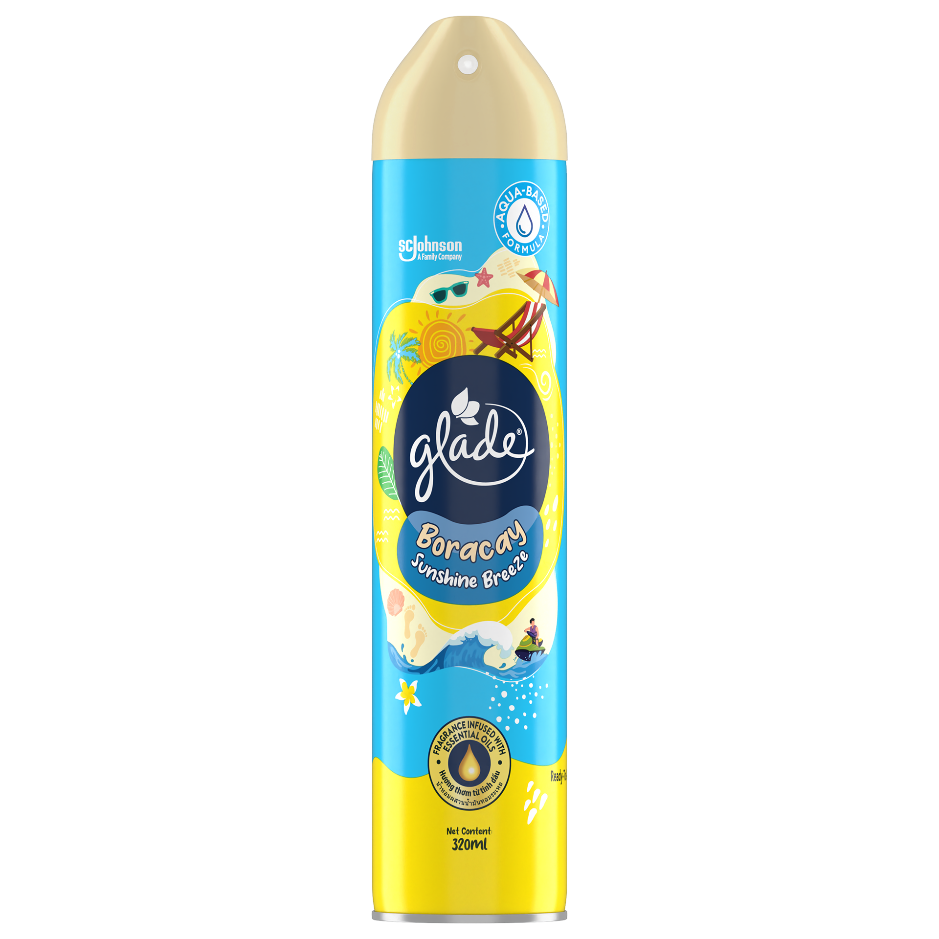
Boracay Sunshine Breeze — sun, sand and surf on a bright blue can.
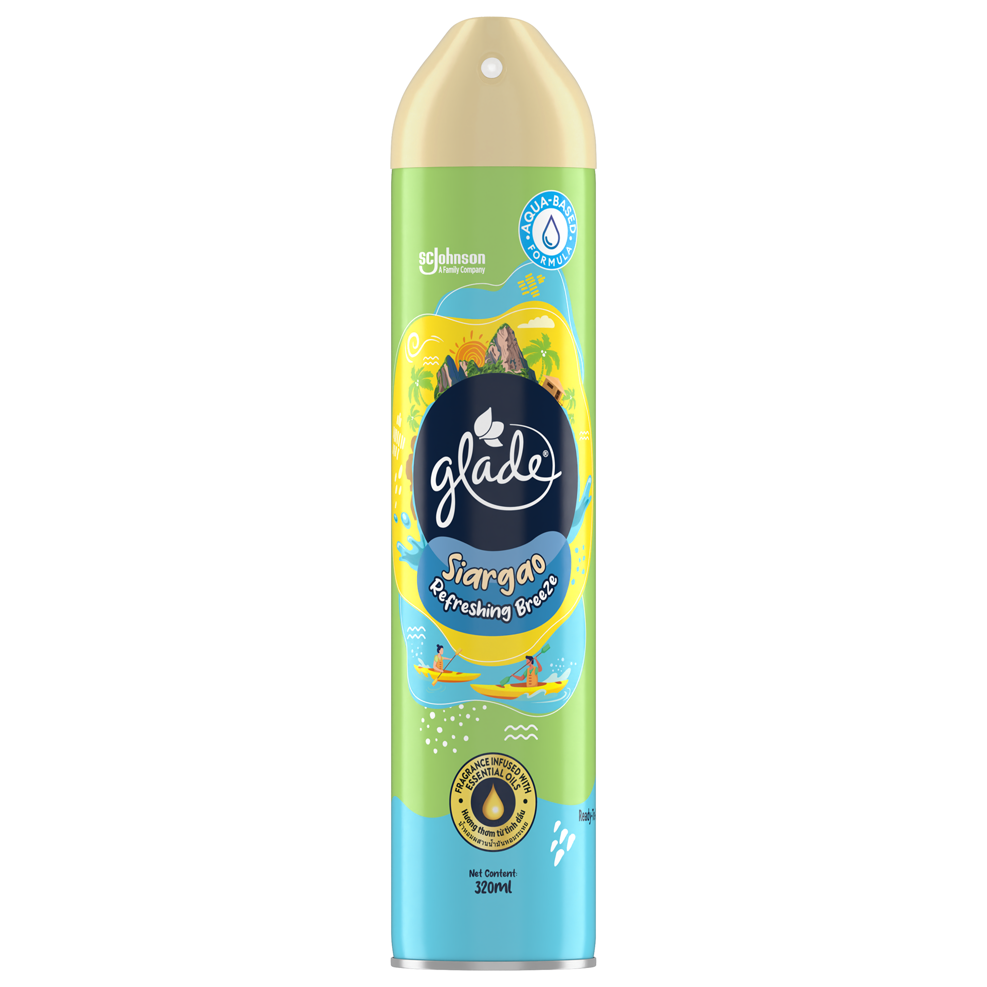
Siargao Refreshing Breeze — palms, peaks and kayakers on a fresh green can.
The craft is in the balance. The Glade navy masterbrand lockup anchors every pack so it's unmistakably Glade; and the destination illustration does the emotional selling on top. Crucially, the system had to hold across two very different structures — the tall 320ml aerosol can and the squat scented-gel tub — so the range reads as one coherent family whether it's standing on a shelf or sitting on a side table. This packaging is where the Spraycation campaign becomes physical: the vacation you saw in the key visual, now an object you can pick up and take home. As a creative agency in Kuala Lumpur, we made the destination the hero, and built every pack to make an invisible scent look like somewhere you'd rather be.
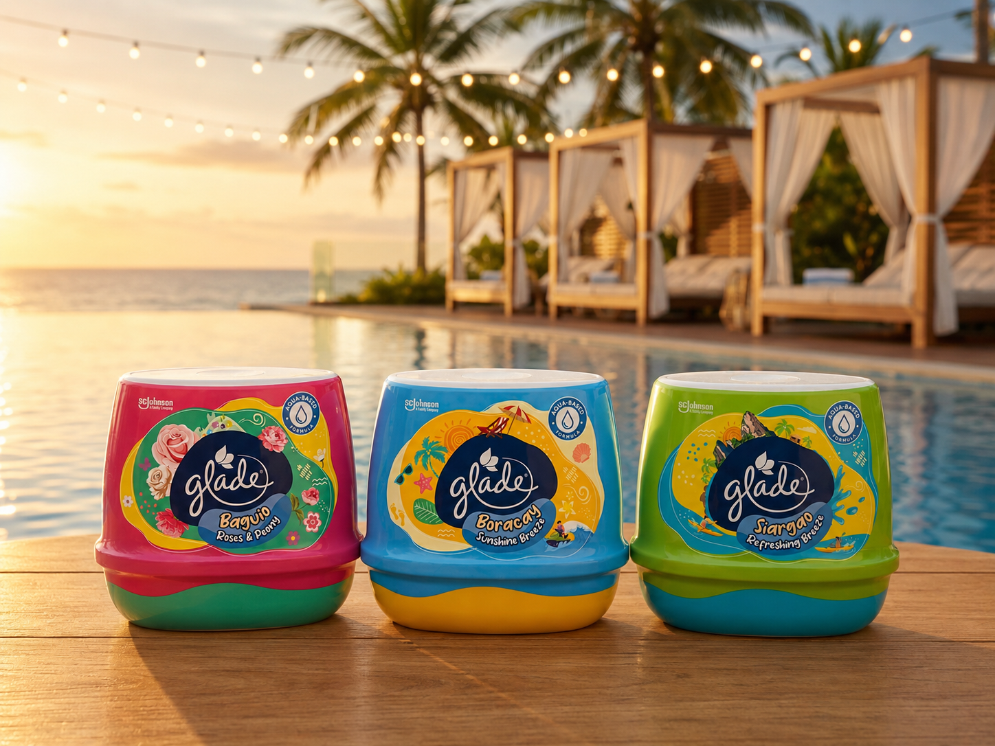
The scented-gel format in a poolside setting — the same destinations, the same system, styled for a tropical Filipino summer.
Baguio Roses & Peony — the same highland-floral world in the scented-gel format.
Boracay Sunshine Breeze — the beach-day variant in the scented-gel format.
Siargao Refreshing Breeze — the surf-coast variant in the scented-gel format.
A campaign can make someone feel something on a screen, but the pack is where that feeling has to convert into a product in a basket — and themed, campaign-linked packaging is the bridge between the two. The discipline is translating a single big idea onto a physical object that still has to do all the ordinary jobs of a pack: signal the brand instantly, communicate the variant and the benefit, stand out in a cluttered category, and survive the shift across every format the range ships in. Done well, the pack doesn't just carry the campaign — it is the campaign, in the one place a purchase actually happens. On-pack illustration becomes storytelling; colour-coding becomes navigation; format consistency becomes a family. As a creative agency in Kuala Lumpur, we design campaign-linked and themed packaging, multi-format range systems, and destination and limited-edition pack illustration across air care, home care, food and beverage, and consumer categories — for FMCG brands across the Philippines, Malaysia, and Southeast Asia.
Capabilities applied to this project: Glade Spraycation packaging, Glade Philippines packaging, Glade air freshener packaging design, destination fragrance packaging, campaign-linked packaging design, themed limited edition packaging, multi-format range packaging, aerosol can design, scented gel packaging design, on-pack illustration, SC Johnson packaging design, air care packaging design Philippines.
Got a campaign idea that needs to become a product people pick up off the shelf?