Client: Tempo (Vinda Group) | Category: FMCG, Personal Care, Tissue & Paper Products, Facial Tissue, Pocket Tissue | Scope: Key Visual Design, Product Visual System, Retail Communication, Digital Assets | Market: Malaysia | Agency: Laugh Contagious Communications, Kuala Lumpur
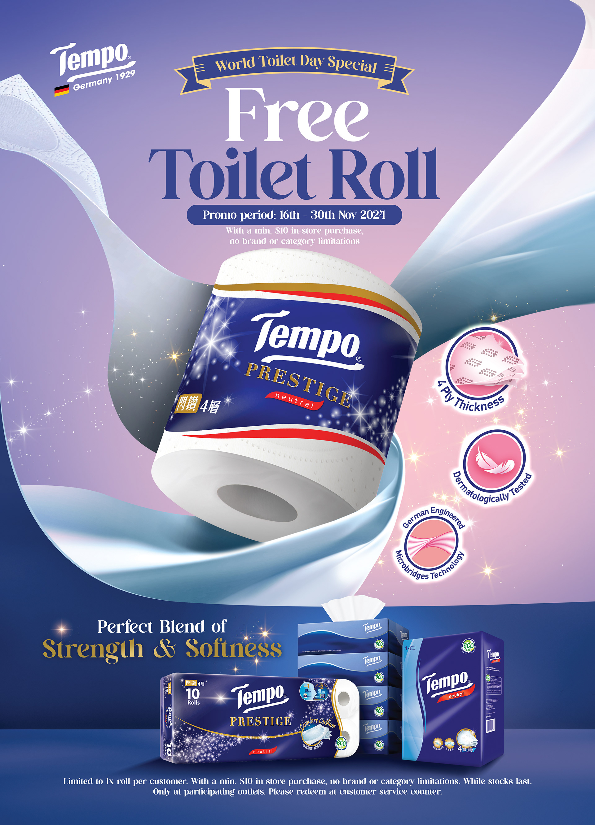
Tissue is one of the most quietly difficult categories in FMCG. It's low-involvement — most consumers grab a pack without a second thought. It's commoditised — nearly every brand promises soft, strong, and absorbent. And it's price-sensitive. Yet Tempo competes in that category as a genuinely premium brand, which means its creative job isn't to shout the same functional claims louder. It's to make a premium tissue feel chosen rather than simply grabbed — to give an everyday essential the visual quality, lifestyle relevance, and design appeal that justify reaching for it over a cheaper pack on the same shelf.
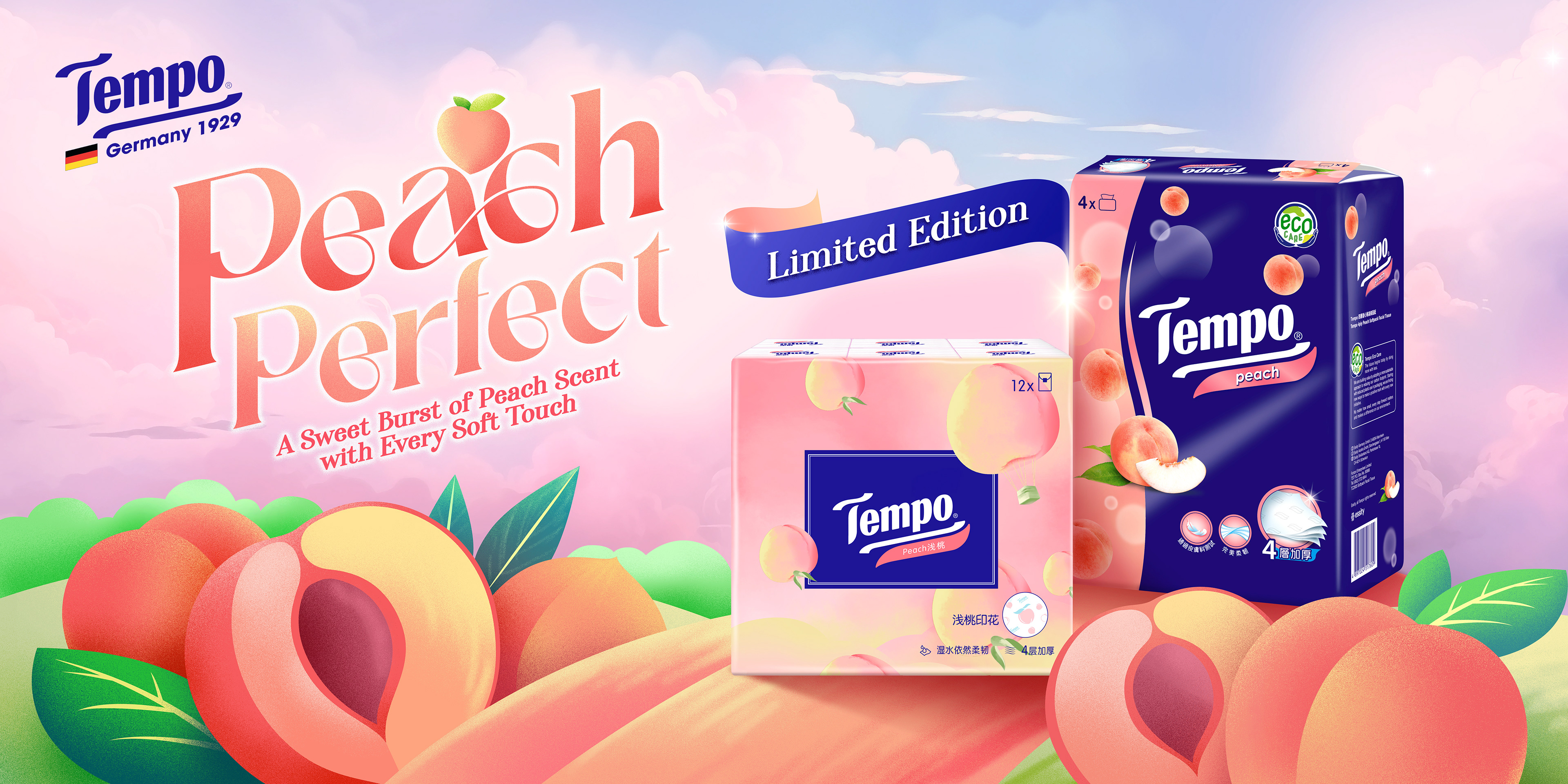
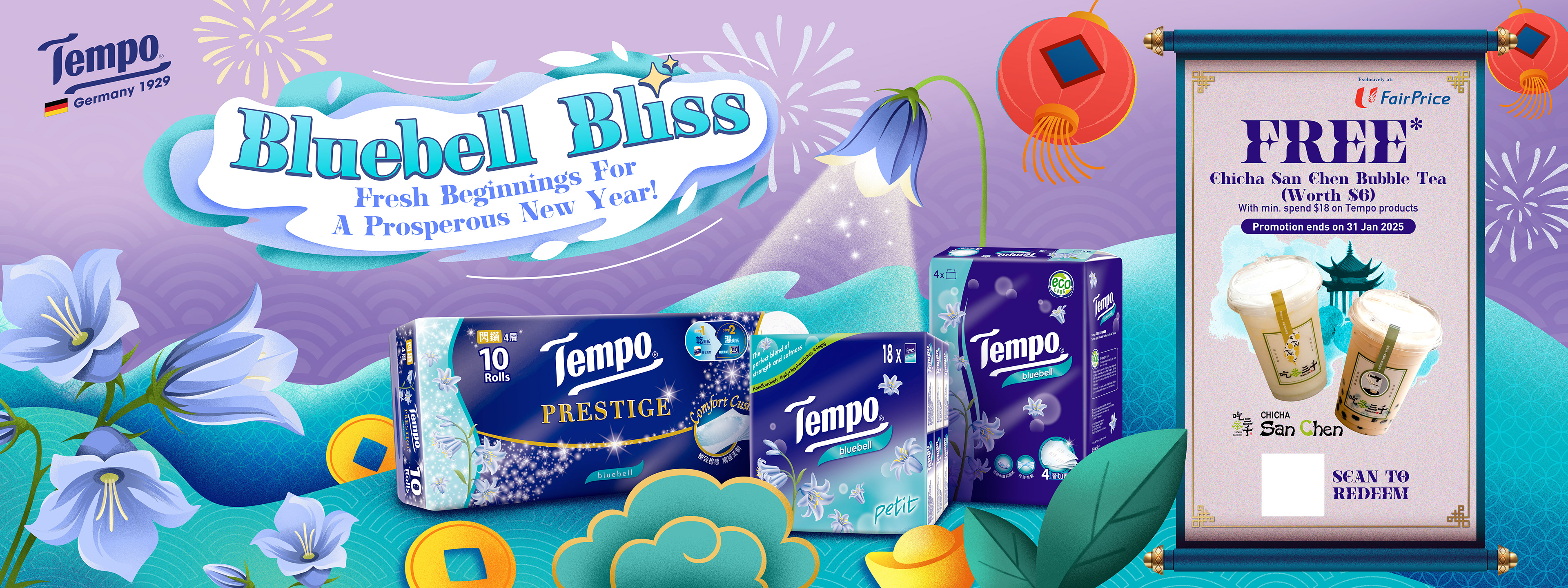
Tempo Key Visuals — making a premium case for a product most people buy without thinking.
Design-led variant detail — premium tissue as a small, considered everyday object.
For Tempo's key visual work, we built a visual system designed to elevate tissue from a functional commodity into a premium, design-aware lifestyle product. Clean compositions, soft tactile cues, premium colour palettes, and elevated styling reinforce the brand's quality and gentleness — translating softness, comfort, and everyday confidence into a visual language the eye can recognise instantly. Developed across key visuals, product visual systems, retail communication, and digital assets, the work positions Tempo as the premium choice in a category where most brands compete on price, and most design competes on noise.
Soft tactile cues — gentleness and comfort rendered as something the eye can recognise.
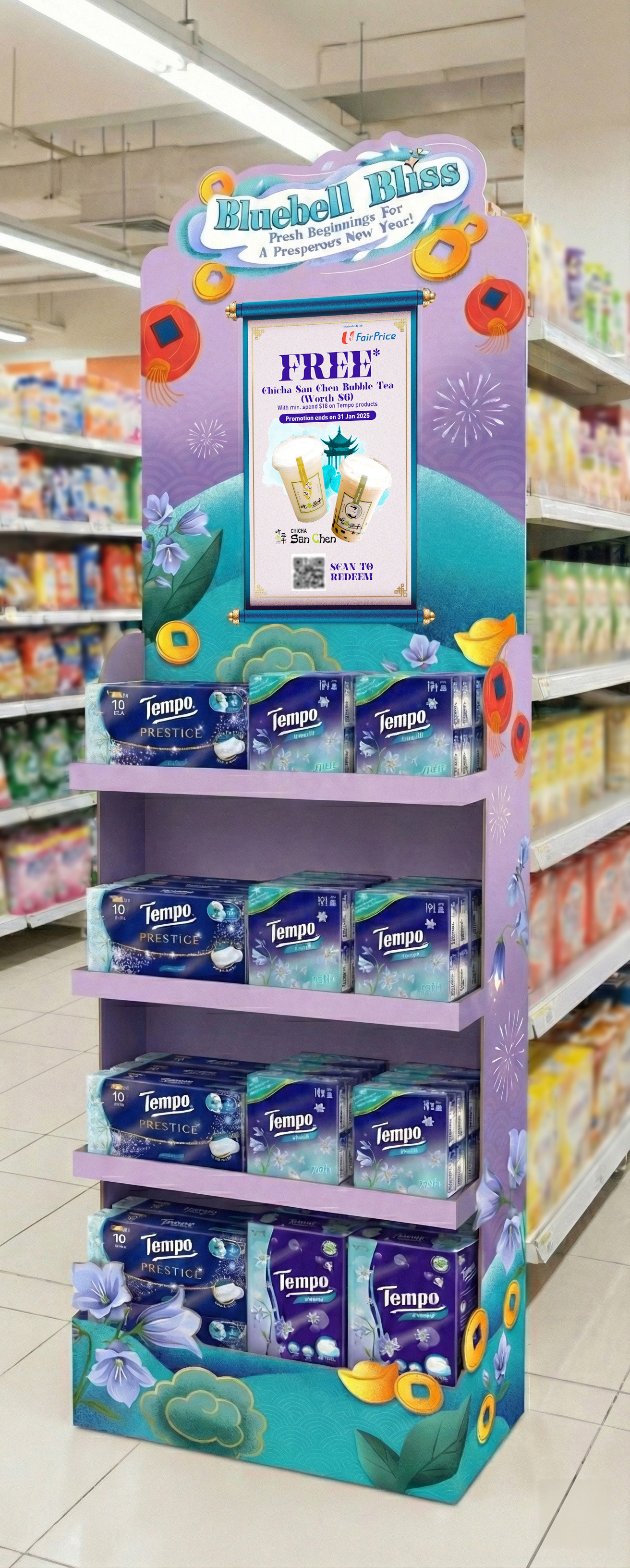
On the tissue shelf — premium positioning standing apart in a category that mostly competes on price.
The hardest creative briefs aren't always the glamorous ones — sometimes they're the everyday categories where the product is genuinely commoditised and the consumer barely thinks before buying. Tissue, cooking oil, soy sauce, salt, paper goods: categories where the design itself has to do the work of making a premium brand feel worth the extra ringgit. Doing it well means resisting the category's default visual grammar and borrowing the language of premium lifestyle instead — softness rendered as craft, function rendered as quality. That's the design discipline we bring to tissue, paper products, personal care, and commoditised everyday FMCG categories for brands across Malaysia and Southeast Asia.
Capabilities applied to this project: Tempo key visuals, Tempo tissue campaign Malaysia, Vinda Group creative agency Malaysia, tissue brand campaign design, paper products FMCG campaign, facial tissue campaign Malaysia, premium tissue brand design, personal care FMCG campaign Kuala Lumpur, commodity category elevation, premium FMCG visual system, FMCG key visual design Malaysia, everyday essentials brand design.
Got an everyday essential, a commoditised category, or a personal care brand that deserves to look premium?