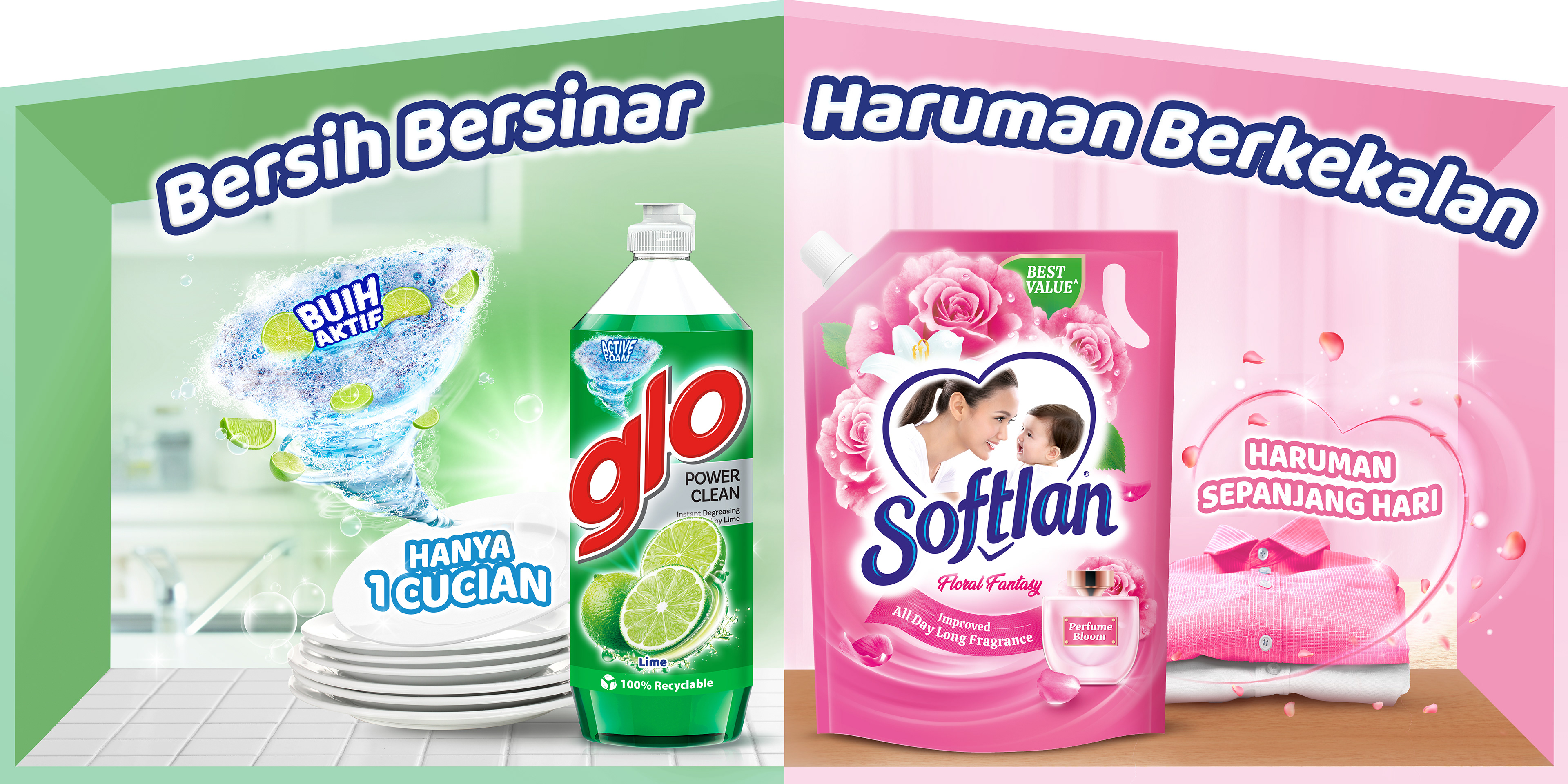
Client: Colgate-Palmolive (Glo) | Category: FMCG, Home Care, Household Cleaning, Dishwashing Liquid | Scope: Brand Repositioning Campaign, Packaging Design, Key Visual System, POSM, Retail Communication | Ranges: Pure & Clear, Nature | Market: Malaysia | Agency: Laugh Contagious Communications, Kuala Lumpur
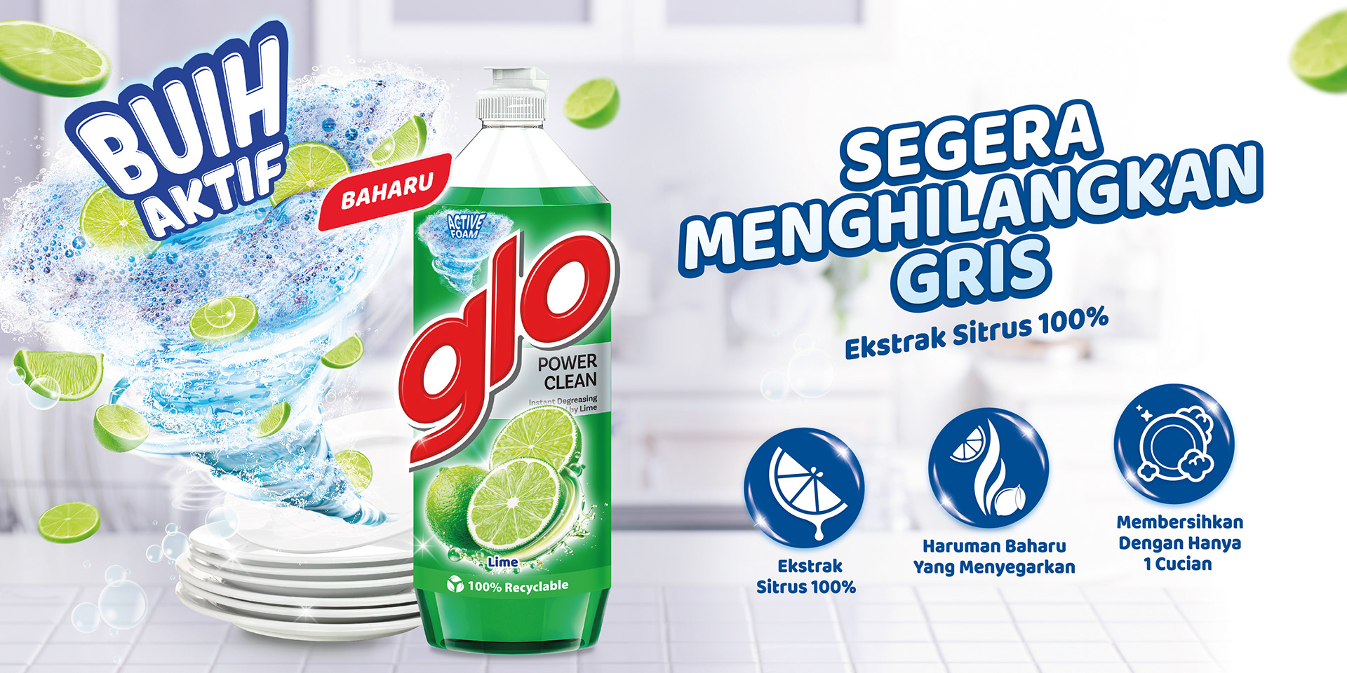
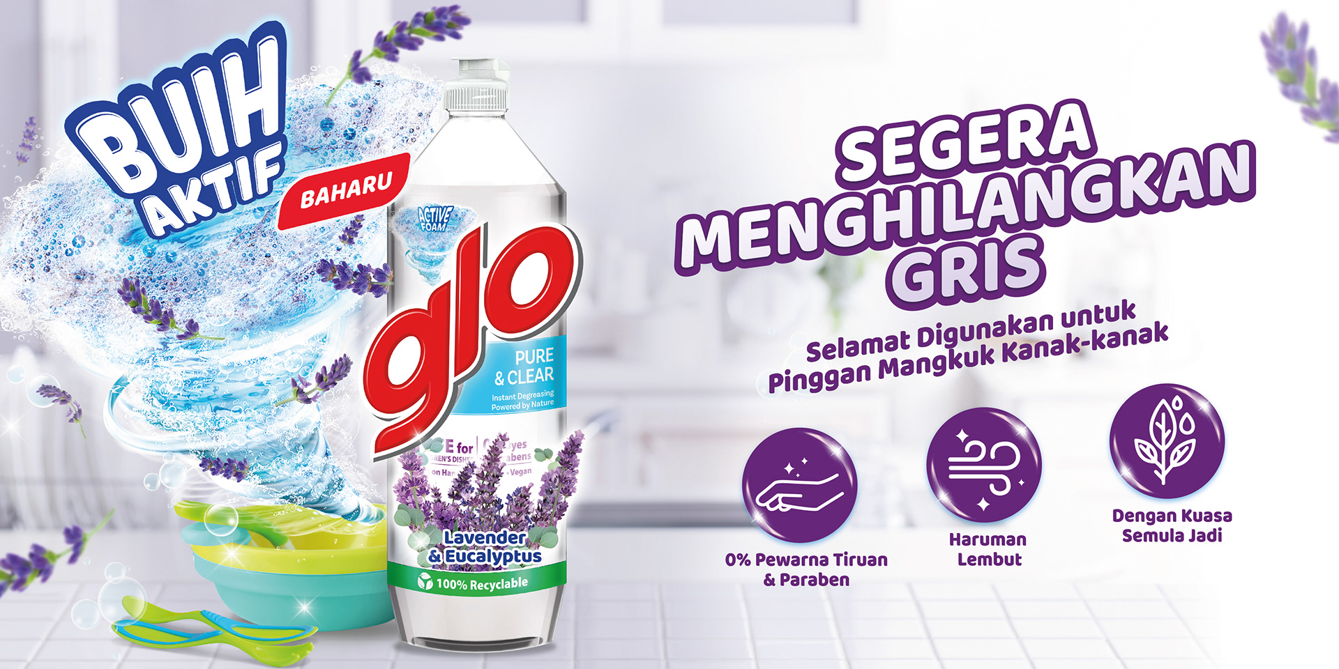
The Malaysian dishwashing liquid aisle is one of the most commoditised shelves in FMCG. Functional callouts dominate — degreasing power, lemon freshness, antibacterial claims, price-led mechanics. Most brands compete on the same visual axes. The creative challenge for Glo's Pure & Clear and Nature ranges was different — not to win on louder functional cues, but to escape that language entirely and reposition the brand into a register the category rarely speaks in: gentle, considered, nature-inspired, and quietly premium.
Water-inspired textures — sensory cues that reinforce mildness and clean.
Botanical cue detail — natural language used as positioning, not as garnish.
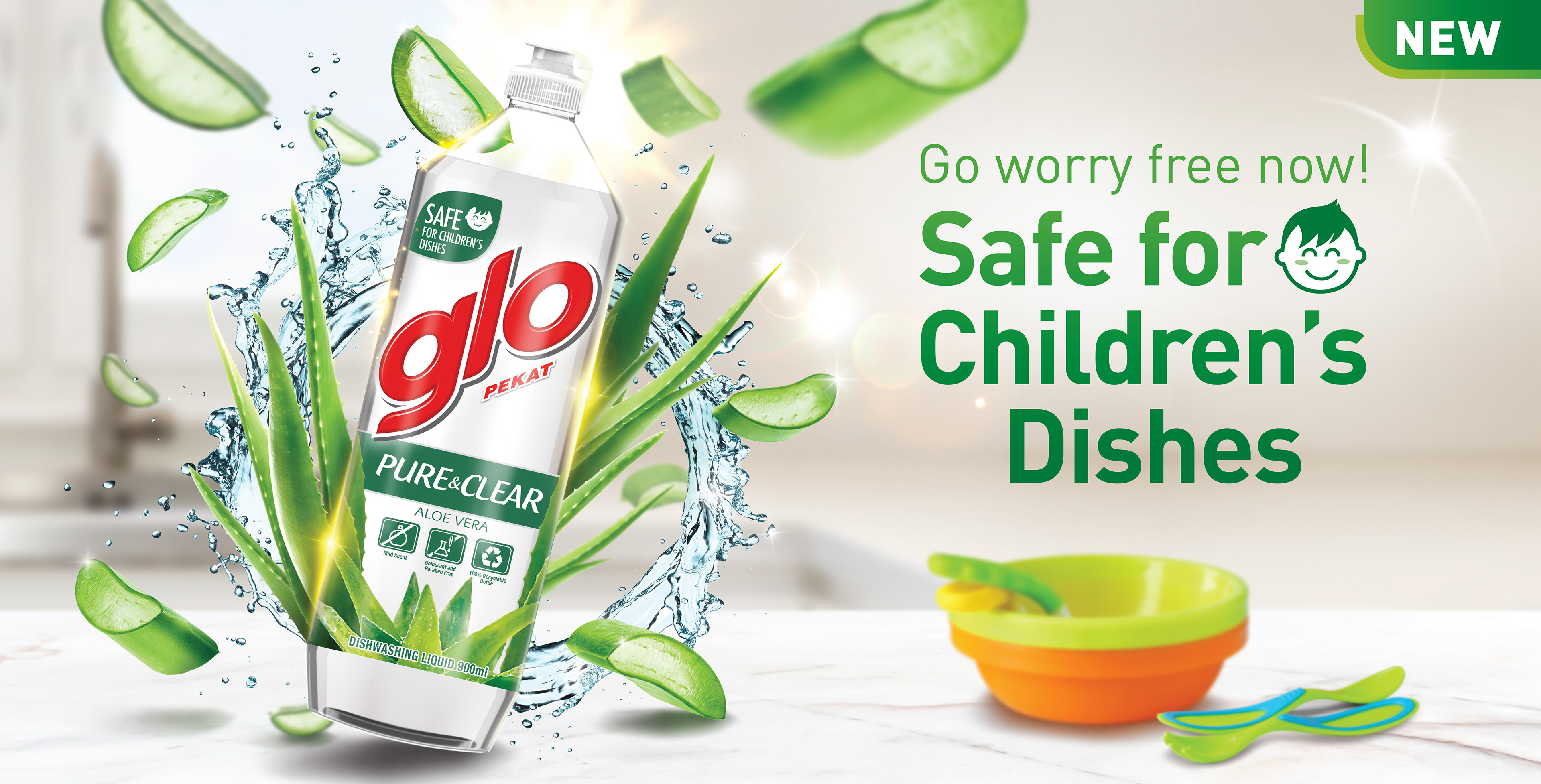
The Pure & Clear range — mildness and care, rendered with restraint.
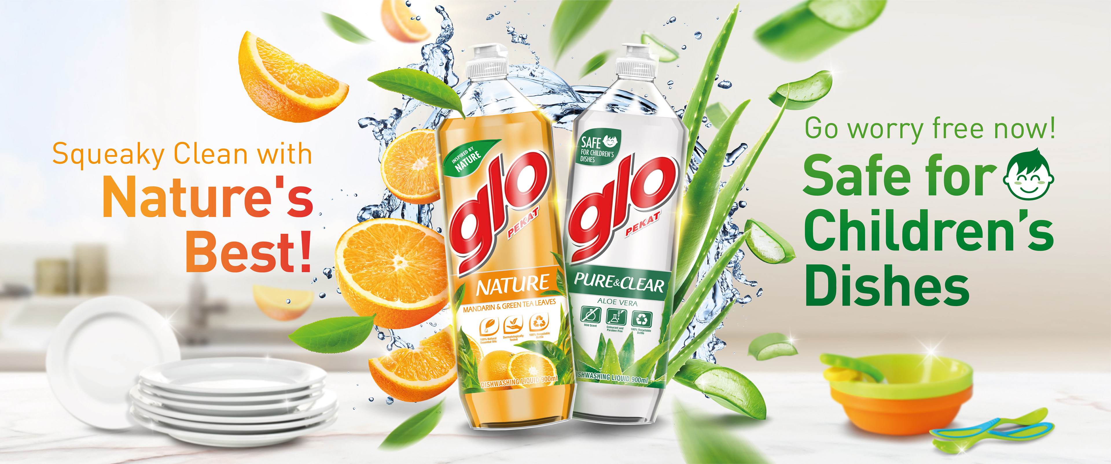
Two ranges, one cohesive visual language — quietly premium, unmistakably gentle.

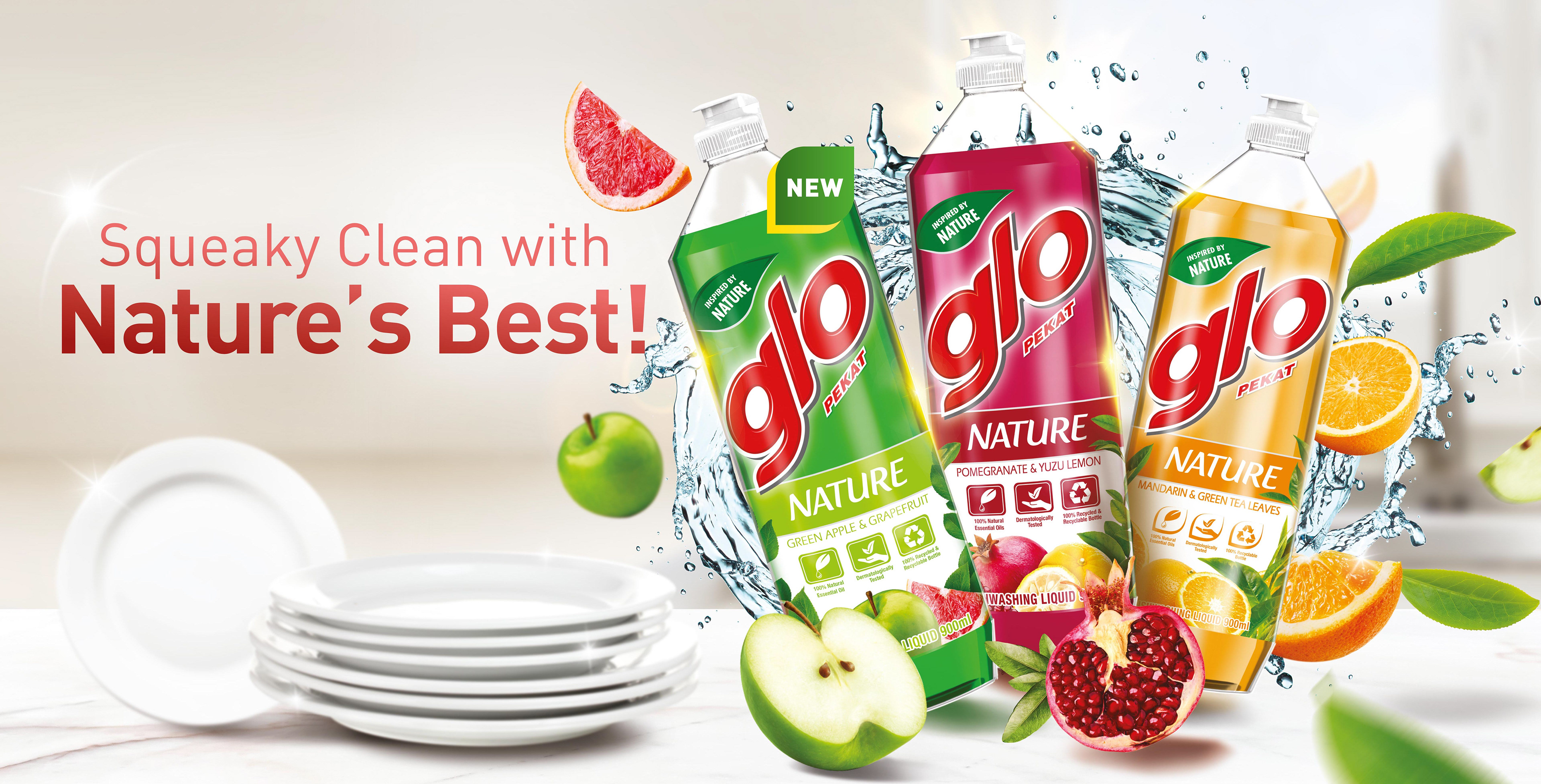
The Nature range — botanical cues woven through with intent, not decoration.
Colgate-Palmolive Glo — escaping commodity language in a commodity category.
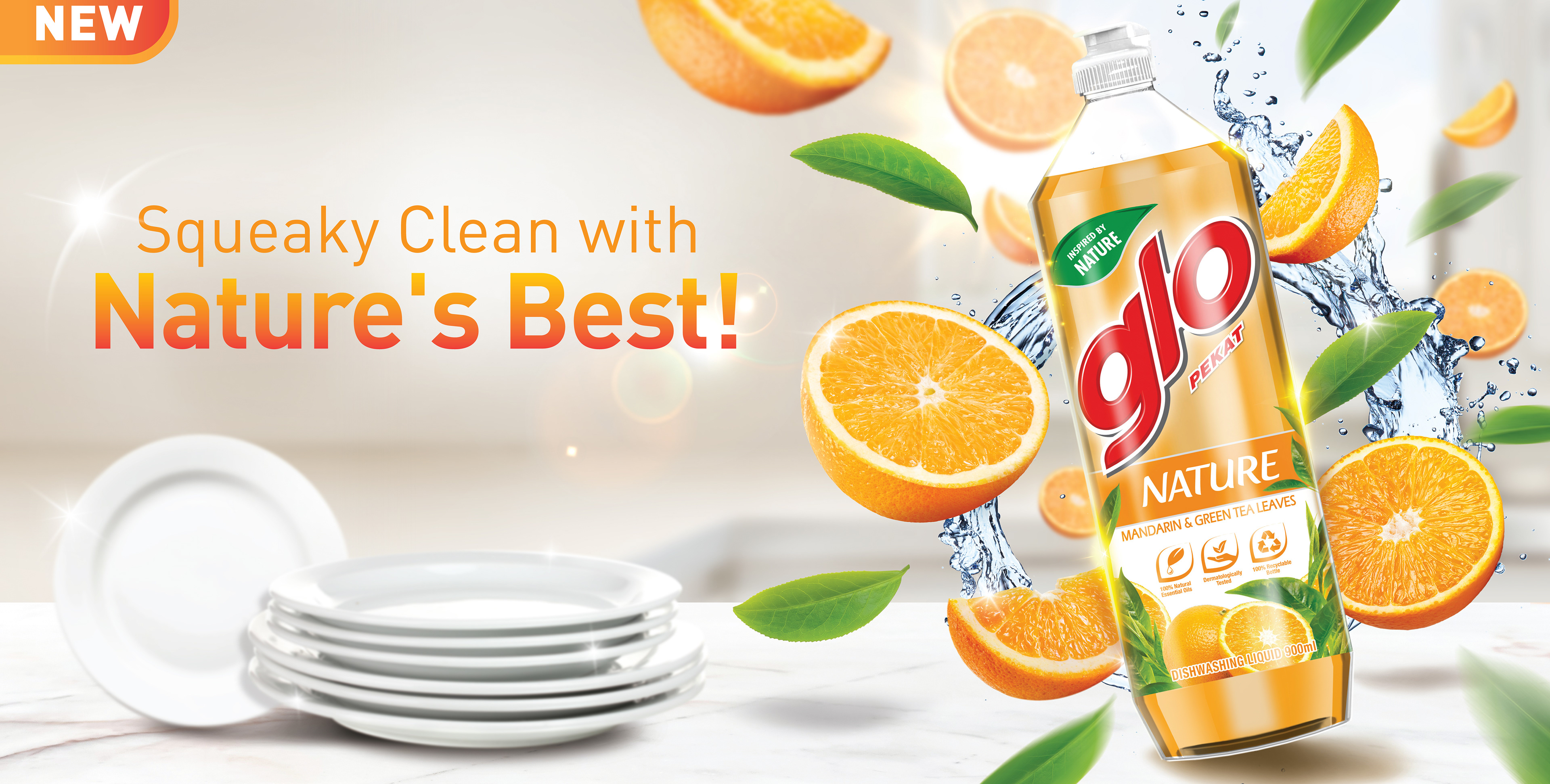
The Nature range — botanical cues woven through with intent, not decoration.
The hero key visual — soft natural palettes positioning Glo against the noisier visual default of the dishwashing aisle.
The visual direction leans into soft natural palettes, fresh botanical cues, water-inspired textures, and clean compositions to reinforce mildness, care, and everyday comfort — positioning Glo as a dishwashing brand that takes care of hands and home rather than one that simply attacks grease. Developed across key visuals, packaging systems, POSM, and retail communication materials, the campaign balances necessary functional reassurance with a more lifestyle-led aesthetic — designed to stand out on the most visually noisy shelf in home care.
Capabilities applied to this project: Colgate-Palmolive Glo campaign, dishwashing liquid campaign Malaysia, home care FMCG campaign, household cleaning brand repositioning, FMCG packaging design Kuala Lumpur, nature-inspired FMCG design, commodity category repositioning, Colgate-Palmolive creative agency Malaysia, FMCG key visual system, premium home care visual system Malaysia.
Got a brand stuck in a commoditised category, looking to break out of the visual default?